3.23.2007

how did I get here?

Verbatim Google searches that have led people to this blog:
what is olfactory
what is tyranny
london's national treasures a red pillow box
ancient rome street scenes
morgue slab
what did Karl Blossfeldt do as a child
peevishness
onion skin paper
Love's Baby soft
wow man far out
greetings from anywhere
crystal palace favorite dessert poo recipe


• • • •

On the subject of lists, a beguiling selection of card games:
whist, piquette, cribbage, euchre, pinochle, bezique, canasta, fantan, mah-jongg

and, real-life business names:
Operative Cake Corp., Scientific Foods, Boring Business Systems, Aggressive Glass and Mirror, Dent Hardware, MS Carriers (think on that one a bit, the tagline: "delivering your future")

and also, bird names:
little grebe, cormorant, coot, curlew, whimbrel, magpie, jackdaw, rook, crow, bittern, lapwing, nightjar, thrush, bunting potoo, limpkin, petrel, snipe, shrike, crake, grackle,loon, dotterel, ouzel

Kangaroo, Brooklyn, 2005

3.21.2007

'vibrant', yes, 'artful' too


In a comment on a previous post of mine ("the vibrant line") regarding fashion illustration (appreciation; death of) "Robin" mentions an illustrator I hadn't heard of and so I did a little googling. Sorry to say I didn't come up with all that much of substance for Kenneth Paul Block but I did retrieve something unexpected: display pages for an intriguing exhibit held at FIT in 2004 called, The Artful Line. While the site is nothing to look at it does feature a few choice things from the special collections in FIT's Gladys Marcus Library. At top, George Barbier's frontispiece for the magnificently titled Falbalas et fanfreluches, 1924. With its very contemporary-seeming winding tendrils and graphic silhouette it's difficult to believe the drawing is 83 years old. Directly above is an amazing cover for the Surrealist magazine, Minotaure, 1936, by Matisse. Below, what Carl Erickson was doing for Vogue the year before (from a good visual selection at something called the American Art Archives). It was in the air I suppose.

3.16.2007

"on vacation"

My mother has been going through old slides. "What do we do with all of these," she said, meaning the 20 or more antique-looking metal boxes stored at the top of the closet in my old room at home. Most of these had been fixtures in the closet for as long as I can remember. Each box, a paper label fixed tenuously with yellowed tape, had a cursory jotting of a place-name or two and dates. There was no logic behind either cataloging or labeling and one box might read, "Rome 1962" and "Jerusalem 1966" and "England '75." Once, perhaps, years ago, we'd taken out a tank of an old slide projector and looked at some scenes, overexposed, familiar faces squinting and smiling against a backdrop of notable classical antiquities, but most have never left their boxes.

The other day, my mother handed me about 12 slides and asked if I could "make pictures out of them." They were of, I suppose, an important occasion, at least to my parents: my baptism, and attending scenes, in Jerusalem. The fact of this event was often mentioned to me over the years, as though it was supposed to be momentous for me, give me some defining insight. But no particular details stuck in my mind from the repeated tellings (and I'd never seen anything of the actual trip) except the bare cast of characters: me, my parents, "the Archbishop," and a kindly nun who took a liking to me. That and the fact that a bus load of German tourists evidently filmed the proceedings (which took place in a row boat in the Jordan River) from the shore. No documentation of that mind-boggling scene exists in our collection unfortunately, most likely because my father, who does not swim, was afraid of dropping the camera. Of the slides we do have of that expedition, this one, above, struck me immediately. Its far more spontaneous and ... exhilarating than any of the others. There I am, a comically oversized infant, surely larger by half than any local child-- unwitting emissary of the American Good Life; a triumph of vitamin-enriched formula and fluoridated water. But its the kindly nun— that kindly nun—looking ancient and very foreign and captivating in her black garb, that is the center point of that image.

Many years after that photo was taken my aunt, on a tour of the Holy Land, stopped in at this convent. She told my mother that she'd inquired after the kindly nun but was told she was "on vacation." It was only later we realized, in the amazing and somehow beautiful elision of that reply, that the nun had died.

3.13.2007

HBO, BBC and SPQR*

Gladiator was on cable last week and I'd forgotten that Derek Jacobi featured so prominently in the movie. Jacobi is cemented in my mind with I, Claudius, the risqué and influential BBC drama (it played here as a Masterpiece Theater) that was an illicit thrill to a certain 7th grader at the time. Gladiator prompted me on to do some 'Claudian' research, and, yesterday, a browsing expedition to the library, which yielded the awkwardly-titled "Mammoth Book of Eyewitness Ancient Rome."** All that was then joined by my weekly Rome viewing. I've been on a veritable Roman Holiday.

Periodically I go crazy over some tv show or other— watch religiously, pore over details obsessively, proselytize— and right now
I love HBO's Rome. (above, images of the Rome set at Cinecitta, Rome's --the city-- famed studio, and apparently the world's largest standing set). The series has a rankness, a gutter naturalism, that's a vibrant contrast to the white marble pomp one is used to seeing. There are several scenes in fetid graffiti-marked alleys and two and three story wooden tenement houses. From the finer points of animal sacrifice to the murky dimness of life by oil lamp to the blotting powder spread on a freshly written document, the small passing details of the lives of the working populace are the most fascinating aspect of the series for me.
------
There is a good deal of blood, both human and animal, and just about every other body fluid
as well being flung around by the bucketful. BBC News reported on the show's more lurid charms, with a comical mix of prurience and formality, in an early review:
"Rome drama generates shockwaves"..."Those who do not switch off in disgust will be treated to a flogging, a crucifixion, numerous deaths and an impalement."
I stand by my obsession and am crushed that the series isn't returning for a third season. It appears that the scope of the production just got out of hand. An astonishing tidbit I just picked up from the bbc site:
The Roman coins were all made at the Vatican mint, and have the likeness of the series' Caesar, Ciarán Hinds, stamped on them.
How perfect that Rome was brought down by excess.

Addendum: Somehow I neglected to mention the excellent "historian's blog" on the HBO/Rome site. Jonathan Stamp, an Oxford-educated BBC historian,
was the historical consultant for the series. Here he's explaining the significance of "ambition."

images from the sets of Rome, from top: side street (wikipedia); "the spice market" and "view of the Basilica Giulia and the Temple of Jupiter"
(HBO)
*SPQR-- Senatus Populusque Romanus "The Senate and the people of Rome" Used as an official signature of the government
** The book is a series of excerpts from various sources of the time. Here Suetonius, the Dominick Dunne of ancient Rome, gives some background material on Julius Caesar: "And that no man might have any doubt how infamous he was for sodomy and adulteries, Curio calls him, in one of his orations, 'Every woman's husband and every man's wife.'"

3.10.2007

typeHigh, Hello (again)


: : : Stylish missives produce smiles upon the most snarling countenances : : :

Tasteful designs of the highest order now available for purchase on Etsy

Letterpress cards by typeHigh, hand printed on 19th-century platen presses.

2.16.2007

the vibrant line


Top: April 13, 1929, Eduardo Garcia Benito; January 2007; 2nd row: March 1, 1949, Marcel Vertes; October 1, 1941, Carl Erickson; December 15, 1936, Jean Pages; 3rd row: December 15, 1932 Erickson; October 1, 1935, Benito; July 15, 1939, Erickson; Bottom: December 1, 1938, Benito
I stumbled on a limited but truly enthralling collection of Vogue covers in the Condé Nast Store. Images available are heavy on the 1920s and 30s, with nothing past the late 1950s, but the offerings are well worth a detour over.

I was quite familiar with the (beautiful) covers of the Twenties. I had studied fashion for a bit, interned briefly at the Met's Costume Institute, and I still have a few books of fashion art. However, nothing prepared me for the brilliant, daring, effortlessly vibrant art of the 30s and 40s covers. The covers in the second row above, especially, are amazingly risky: The strange spiky bird for "Spring," autumnal passing legs--shod in non-descript day wear no less!, and what looks like a pre-saging of Pearl Harbor but is in fact meant to evoke a cruise ship steaming its way toward glamorous shores for the "Resort Issue."
Unusual vantage points, edgy color choices (brown! with fluorescent pink!) and not a celebrity in the bunch. How dull and and flaccid that Angelina Jolie cover is--merely a vehicle for the headline text and a wrapper for the ads. A predictable end product of demographic surveys, publicity campaigning, and marketing pronouncements.

I virtually never buy "women's" magazines anymore and I probably haven't picked up Vogue since the nineties. I do remember illustrators having quite a high profile in the eighties: Mats, Stavrinos, Antonio, Viramontes. What is happening today? And the oddly alienating and irrelevant drawings used in newspaper advertising for stores like Macy's and Lord & Taylor until, what 10 years ago? are they still being used? That was like the dry husk of fashion illustration.
What I wonder is: Did true fashion illustration die without my noticing?

2.14.2007

Highlights from the Collection (part 3)

Another in the sporadic series of posts that both showcase some of my "collections" and offer the easy way out when concentration fails. Here for review: ticket stubs, mostly parking. Note fins on left-hand car diagram; this was found in the mid-nineties.

2.07.2007

I think I need help

I've begun to think that this blog is getting a too scattered. I've just been writing about things that I think about. period. Perhaps I'm "recording" too many "fancies"?

People looking for letterpress and discussions about onionskin paper
(and you wouldn't believe how many people out there are searching for onionskin--what were they THINKING stopping production on that) come by and see posts about found photography. Ephemera collectors find the site and then run away from the (overwrought) philosophical noodling. Then there are the rants about "peaches" or bad architecture...and those abstruse German terms!

Those German terms probably send everyone running.

And to top it off, since I am a graphic designer after all, some friends refer to this as a 'design blog', when of course I haven't written once about graphic design...

I'd most likely do everyone a favor if I concentrated on some graspable topic (and preferably a topic I know something about). Perhaps something prescriptive-- like:

"I am a graphic designer and I've found this cool French site
of "incongruités typographique", where, if you choose your links carefully, you can get free fonts!"

Then I'd have
several nice pictures of foreign- looking and idiosyncratic French hand-painted signs.

Is that what I need to do? Is that what I need to do in order to keep readers after I get great mentions on ephemera, or things? In order to get some discussion going? I really need advice.
Hello? Is this thing on?

2.02.2007

what if Domino magazine...

used this image for one of their "Can you make this outfit into a ROOM" stories? Inane? Yes! But fun...
I was lightly inspired by a recent conversation on finds and fixations with an interiors and design-savvy friend (brand new to the blog world), Mister Particular. Something about that Domino feature fascinates me, silly yet compelling: translating color, line, silhouette into furniture and mood.

I love this painting. I saw it 4 or 5 years ago at an exhibit in London's National Gallery and I was just dumbfounded –the hairdo, the articulated parasol, those shoes! That nose! It is the Portrait of Frau Wilhelmina von Cotta, of 1802, by Christian Gottleib Schick. She's like the Antimatter Universe Madame Recamier and I think she's just captivating.

It's unlikely they'll tackle this one, SO, here's my take:


I know-- the little red cabinet is not quite right (those legs, hmmm). I should have diaphanous muslin drapery, maybe a red cashmere floor pillow... But hey, this isn't an interior design blog|| Most of the items here are from Oly Studio, Mecox Gardens, Stella Christie Lighting, and Benjamin Storck. A wonderful array of Karl Blossfeldt images here, and stunning reproductions of Ernst Haeckel here. The adorable, albeit not-quite-right, curvy red cabinet can be found at anthropologie.

1.29.2007

into the window (with Joseph Mitchell)


If I come across a particularly vivid old photograph, especially if it's a New York street scene, I find it thrilling--as though I've uncovered a bit of treasure. I find I can pore over it so intently, get drawn in so completely, that, if I allow myself, I can almost —almost—fantasize being in the image. It's sort of embarrassing.

To the extent that a photographic image, the rectangle, is a metaphorical window, its frame blocks the rest of the world that continues just beyond those edges. The "glass" is immovable, the "window" shut. I wonder, though, about
what is to the left or the right. Or what connection there might be, in that photo of yesterday, to what I know today. The photographs here are part of a series of modern reprints I found in a drawer at Bowne. I believe they are a set of tax ID photographs taken in January and February of 1928 of the South Street area – in other words scenes right around Bowne. It shouldn't have been a surprise to see that the relatively tidy retail mall of today was rough, ragged-edged and tired-looking in the light of that day 79 years ago.


The dirtiness of the street, the worn and dusty clothes on the worker in the cap (click the details above for very large view), a horse drinking from a stone watering trough, the bundles of rags and paper scraps: the 19th century is palpable. Here, "the modern" is foreign. Seventeen years after these images were taken, Joseph Mitchell described these streets in Up in the Old Hotel:
I could distinguish the reek of the ancient fish and oyster houses, and the exhalations of the harbor. And I could distinguish the smell of tar, a smell that came from an attic on South Street, the net loft of a fishing-boat supply house, where trawler nets that have been dipped in tar vats are hung beside open windows to drain and dry. And I could distinguish the oak woody smell of smoke from the stack of a loft on Beekman street in which finnan haddies are cured; the furnace of this loft burns white oak and hickory shavings and sawdust. And tangled in these smells were still other smells— the acrid smoke from the stacks of the row of coffee-roasting plants on Front Street, and the pungent smoke from the stack of the Purity Spice Mill on Dover Street, and the smell of rawhides from The Swamp, the tannery district, which adjoins the market on the north.
After rereading more of the book, I discovered that the building above, left, in my photograph, 92 South Street, is the "Old Hotel." By the time Mitchell hung around the docks, the restaurant at 92 was called Sloppy Louie's (It was
still John Barbagelata's place in 1928) and the locals stopped in for breakfast specialties like a shad-roe omelet or sea scallops and bacon. (The South Street Seaport of today does not say "sea" or "port" or "shad-roe" or anything marine to me at all, unfortunately...)

The Romantic-era philosopher and essayist Johann Gottfried von Herder created the term Einfühlung, which is often translated as "empathy." Not that I know very much about Herder (as I've said before I know a little about a lot of things, just enough to be annoying) but when I first came across this word I recognized it and identified with it as putting a name to a complicated, elusive and for me, enjoyable, state of mind.
... a "feeling into," [Einfuhlung is] projecting one’s mind into the object of one’s contemplation, of seeing and thinking and experiencing from its perspective and so coming to understand it better, of turning it into a subject and oneself into the object of its gaze.– Robert Daly (SUNY Buffalo)
Herder's intent may be different from my reading of it, but I'm satisfied to have it defined in my own mind.

When I look at these photographs above, I think about being on those streets with
horse-drawn wagons and automobiles and the last shadows of the 19th century, and then I think of Flappers and the Chrysler building, Hollywood and Art Deco, and I can almost see it happening at the same time, just beyond the frame.

1.19.2007

zugzwang!* schlimmbesserung!*


This isn't an actual photo of my old television, but
almost: the rounded corners, the double- decker dials, the on/off/volume knob are all spot-on. It had a small sticker in back that said "manufactured: March, 1987" and it might possibly have been one of the last appliances made with the gesture of faux walnut cabinetry. Over the years I spray painted the cabinet, first gold metallic, more recently white. People would say, "Wow, a B/W tv?!" but it was actually a full fifteen inches of glorious cathode ray color. That recent glossy white coat actually gave it an almost Verner Pantonesque flair, like set decoration for a *Wallpaper shoot. I never really had any problem with it, or with reception (it had a rabbit ears antenna) and the image was just fine until the very end. I finally replaced it, with a new flat screen, shortly after its 19th birthday.

In researching for my next tv purchase I had been told that new(er) television sets were more "sensitive." Sleek, sliver-like, highly attuned, they picked up ambient interference, electromagnetic fluctuations and the like that the old(er) sets, stolid and workmanlike, did not.
No longer could I just plug the thing into the wall and go-- I would need cable. I was enabling a neurasthenic intelligentsia to take over from the lumpen proletariat.

{eight ensuing months}

As I began this post, a gossamer sprinkling of snow glittered in the street lights outside, but my flat screen remains dark. The cable box flashes an insistent 7:15, but it is after 9. My friends in cable repair are coming to visit again!
But I need to wait 3 days.

*zugzwang-- (from chess) A position where one is forced to make an undesirable move.
*schlimmbesserung - literally means, "an improvement which makes things worse."

1.03.2007

four things i can do without this year

No, this is not some vow of self-abnegation. This is some time-honored peevish blogging!

1.
deer heads
It pains me to say because I'm partial to all things surreal and macabre-- and these started out as such. But they've gone cute. Some heads and horns out there are still appealing, though. This one from local Brooklyn design emporium Matter has a nice Baroque kitsch sensibility, but the formerly (and formally) wonderful ceramic antler chandelier, also at Matter, has been tainted by the rest of the herd. They are still proliferating, like here and here, but the deer-head-as-coat-rack is dead.

2.
public privates
This makes me positively shiver with hatred. To what depths of mindless
skank has this country sunk? We're down at (warning: link NSFW) crotch level documenting a rash of "celebrity" front bottom airings.
3.
ornamental kale
They have been sprouting in patches of bare dirt
in front of countless office buildings like alien mold spores. There is just no reason for this.

4. lists
"What do you mean?" I hear you think, "isn't this, right here, a list?" Well, yes. (I could have just updated my beloved opinion circle.) But listmaking has become some knee-jerk, dumbed-down, commercially manipulable, ADD-oriented excuse for content. Ten years ago, during my time at sidewalk.com (the antecedent to citysearch), someone on staff introduced a new feature, something like "Weekend Top Ten." It was a list of the top grossing films of the weekend and how much they made. I remember thinking, "what is that? why on earth would someone be interested in that? That's going nowhere..." Quaint, huh?

1.01.2007

reading old postcards

I'm experiencing some unfortunate blogger technical difficulties so my 'special New Years post' is not ready for viewing. So here's an evergreen from the pipeline:
I collect postcards sporadically. Most of my favorites are peculiar Christmas cards or those of the highly sentimental "pleasant thoughts for a dear friend" sort, the more sugary the better. Some people will buy only blank, unused cards. When I can I'd rather have the entire, completed journey: chosen, written, sent, postmarked, and, implicitly, saved. Some cards may not, on first view, be all that compelling visually, but reveal themselves on closer consideration. Many of the cards showcase abysmal grammar skills: "Best Wishes to yous all," "we are well. Hoping you and your husband is the same." That aside, reading the cards can pay off with some important (well, in a relative sense) tidbits. This Venice scene, postmarked August, 1906, is certainly pretty but hardly extraordinary. But the inscription at top caught my eye. It reads, in part, "... it is very hot at mid day but cool at night. The girls are "crazy about it" as they say..." "Crazy about it" was put in quotation marks. Significant because it indicates the phrase was new as an expression or was considered kids' slang, but yet it had to have been common enough that the author was confident that the reader would understand. Kind of like if I were to write my Aunt Helen saying, oh, 'the "bitches are down with it."' Obviously "bitches" (as a term of, uh, bonhomie) and "down with it" have been around for quite a while in Black slang, not as long in general slang. Still my Aunt Helen might get what I'm saying because the phrases have had currency long enough already for someone like me to write them. So when my American Slang Dictionary puts its citation for "crazy about it" at 1914, I just happen to know, from my 50¢ postcard, it must have been kicking around a fair bit earlier.

12.27.2006

some belated thoughts about "You"

For a while now I've been mulling over the hollowness of "You"-- the purported prime mover in the consumer chain. Design your own personal sneaker, Hummer, pizza. Express your personality through the oxymoronic doublespeak of "mass customization." The escalating illusion is that now, with technology at one's fingertips, the power is in your hands. As with niche marketing, innovations with just your slice of demographic in mind, one is told many times over, "you deserve it." You're so busy/ important/overworked/ worthy, you deserve 500 channels of 24-hr HD sports (or whatever), you deserve soup in a go-cup, a good night's sleep with AmbienCR. Here's a fat-free fudge-dipped caramel bite with extra calcium created expressly for your over-40 bones. Coach or L.L. Bean in your Lincoln Navigator? Your choice! This proliferation of specious choice-- the so-called American ethos of individualism ("freedom") distorted through a lens of consumption. All of this disingenuous catering (pandering?) to "you." And then last week Time made "you" the Person of the Year in one of the most oleaginous essays I've read recently:
And we didn't just watch, we also worked. Like crazy. We made Facebook profiles and Second Life avatars and reviewed books at Amazon and recorded podcasts. We blogged about our candidates losing and wrote songs about getting dumped. We camcordered bombing runs and built open-source software. ...Who has that time and that energy and that passion? The answer is, you do. And for seizing the reins of the global media, for founding and framing the new digital democracy, for working for nothing and beating the pros at their own game, TIME's Person of the Year for 2006 is you.

What about me? Despite both designations having to do with the individual, presumed solipsism, and implied atomization, the "Me" of the Me Generation (I believe it was Tom Wolfe who christened the 70s the Me Decade, with "generation" being an extrapolation from that.) strikes me as a different concept. At its most elementary level, the term is subjective: me, I. And I read the term, at very least, as active --seeking out self-definition, though not necessarily through consumption. This "You" moment conveys an object observed and defined by others: what you buy, what you own, your 'audience.' The you as consumer defined by age/income/race/ demographic...
---
I only just recently saw the Frontline show "The Persuaders" on the web, although the episode is more than 2 years old. It is a disturbing and utterly fascinating overview of the current culture of marketing and advertising and its societal influences. The web site for the episode is dense with interviews, transcripts, commentary--it is a must. Someone there (cant remember which person sums it up) distilled for me what had been ill-defined complaints and ravings: the danger of an atomized populace in a completely immersive, consumer-driven society is that there is no longer a recognition of "the common good," or civic duty; democracy itself comes apart. Media critic Mark Crispin Miller (whom I had not heard of before) delivers some of the most devastating commentary.
Consumers are feeders. All consumers do is consume. ...They're being manipulated to think only about the grass that they're chewing and nothing else, and manipulated into thinking about ways to get more grass. They're not operating on a sufficiently high level to participate in a democracy…
---
So the Burger King "have it your way" campaign of circa 1974 (?) was a brilliant precursor to the mass customization model...

12.22.2006

a new world christmas


While I gather my thoughts and work on the several posts sitting in the "draft" line I'll put up 3 cards from my Christmas collection. At top is the very curious "Christmas Greetings from the New World." The reverse says the card was "printed in Saxony," obviously in English, though it was sent "To Willie, from Harold" entirely within the confines of Brooklyn. It is postmarked, 8 pm, December 21, 1911. The bottom two, polka dot sleigh ride and manic circular Yuletide, match, by happenstance, in warm red and silver, and are from c.1930.

12.19.2006

typeHigh wrap-up


UPDATE Perhaps I should state the following reminder: these posts are my thoughts, not those of typeHigh or my business partner or anyone else. Aesthetic commentary aside, we certainly benefited from participating in the sale and I could have been more gracious about that. Also, I should have made clear the "Iraqi" comment below referenced a story in the Times that day that made a point about fluorescent lights.

At the risk of being tedious: a quick overview fr om the sale. TypeHigh managed a respectable showing at the Center for Book Arts sale despite the fact we were out of our element aesthetically. Thanks to Doug's ingenious handiwork we had a professional display rack and many of the trappings of a real business. Most importantly, people (strangers, even!) will be writing and sending our cards. Amazing.

The tenor of the event was more clogs and rainbows than I'm comfortable with and the room, a ragged loft space awash in fluorescent light, said to me 'Iraqi detention center' a lot more than 'Happy Holidays.' We were made acutely aware of the need to find the correct audience.

Our "Lucky" magnets--vintage wooden Bingo pieces-- were a surprise hit. (Though when people asked why they were lucky I was tempted to just say "'cause I said so." They're Bingo pieces, people, they won't help you get a new job). The type on the tag was hand set in a great metal face from the Bowne collection called
Samoa. Its got a quasi-"oriental"/Art Nouveau flourish to it. A little Googling finds that Samoa became a US territory in 1900, and I'm guessing the type was issued around then.

Trying to catch a cab after the show on Twenty-seventh and Broadway was far more dicey than I would have imagined. Clusters of what in another decade might have been termed hoodlums gathered in darkened doorways. A guy selling garish pink and blue fur pelts was talk-yelling animatedly. Was it heavily accented english? Something else entirely? Raised voices could have meant people having a good time or a fight about to break, and there was no easy way to tell.

A highlight of the evening was a chance to see Robert (Warner's) basement workshop in the Village (There's Robert in the mirror, above, left). Though there was a little hesitation on his part-- too many people? delicate sensibilities likely to be offended? embarrassing things left in view? rat poison? -- we prevailed. Down the stairs, through a door, along a narrow dilapidated corridor, right, through another door, out into a small rear courtyard and to the left, by the wooden stairs. We all crowded into the workshop past jars of lamp black and springs, boxes marked "marbles" or "better photographs", piles of papers, Howdy Doody heads, books, toy eyeglasses, drawers open and quietly exploding, and an ample sprinkling of glitter.

When we'd taken in all we could, we went back, around, up and out for some Pan Asian cuisine
at a sprightly little restaurant in the shadow of the Jefferson Market clock tower.

12.11.2006

typeHigh, hello!


One might think it a happy coincidence that the Sunday Times reports on the resurgence of letterpress printing just when my friend Doug and I debut our line of hand-printed cards. One could think so. But if one were me, one would know better. Everybody and their uncle is churning out letterpress these days and furthermore if you're reading about it in the Times, it's already gathering momentum on the long slide to "over."

In any case, Doug and I have lavished absurd amounts of time on the venture we're calling typeHigh.
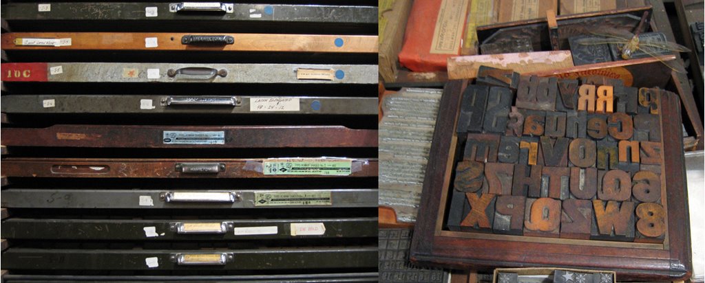
I probably would have preferred to wrangle over the name a bit more, but luckily Doug is a decision maker. (If it were just me, I'd be tempted to call myself 'negative space press') Type high means, simply, something at the same level as the face or printing surface of the metal type (see the diagram, above, from the very informative briar press). Some of the cards are based on 19th century type specimens, others are just free-wheeling experiments, all incorporate some 19th ornament. Despite the grand intentions, and generous donation of much-discussed onion skin paper, we never did manage to line our envelopes. (I regret not being able to add that detail but years would have gone by, I'd be a bitter, ink-stained crone and we'd have worn out the super-human generosity of Robert Warner at Bowne & Co. And as I think about it, it would most likely have been just a bit de trop) Most of the cards are 3 or more colors which means we fed the card through the press once for each color plus another for the imprint and another, still, for scoring. And these are brawny 19th-century foot-powered machines, no sissy power- or Vandercook presses! My leg muscles are now comically over-developed.

We will be sharing a miniscule portion of Robert's abundant table of wonders
(typeHigh and piled high. AH hahaha) attempting to sell our wares at the Center for Book Arts Holiday Sale. Look for our panicked, clueless faces at the

Center for Book Arts Sale
Friday
12/15 ($10 benefit), 6-9 pm
Saturday 12/16 (free), 11 am to 5pm
28 West 27th Street, 3rd Floor

12.04.2006

jersey shore


I think I will make "Highlights" a regular feature here.
Inspired by a great found-photo site I came across the other day, Square America
, I'm hauling a few of my acquisitions out of storage.
From top: Sacred Snakes of India
. Aside from the great banner and imposing pavilion, what got me to part with my $2 or whatever were those penants flying atop the cupolas. Obviously some sort of carnival going on. I would say 1890-1900. A sideshow sensibility to a snake attraction I think, rather than state fair. No hint of beach or I would hazard Coney Island.
Creepy Family. Rather Dust Bowl/Grapes of Wrath/American Gothic, no? Farm worker family portrait c 1930, perhaps. I read a lot of helpless befuddlement and resignation in Father's face. He's actually rather handsome (
and note the meerschaum/calabash pipe), unfortunately the children inherited all their genes from Mother who appears to be part woman, part bull terrier.
Revelers. I like the cheeky gaiety of the set up but I found something very peculiar about the perspective in this shot. Is it a composite? No, but the "Equestrienne", the Joycean man and the Roadster Couple don't seem to sit in the same plane. It's particularly nice the way the car seems to be driving out of the frame at left. Eight people, c. 1918, out on a lark, as they might have said. I think I could have been friends with them.
Little Bear. A new acquisition. He sort of reminded me of Arne Svenson's Sock Monkeys. Oddly, the inscription on back reads, " Nov.1944/ autograph dog/ To Bob/From Snook McCloskey" I Googled Snook McCloskey, hoping to find something. Alas, no documents returned on that search.

Next time: antique buttons-on-cards? or perhaps my as-yet-very-limited "old library card" collection. Let's vote.

12.02.2006

Bowne & Co.


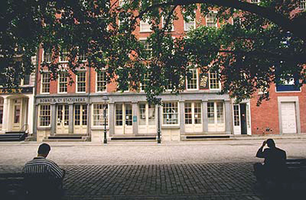
Almost every Sunday for the past few months I've been at Bowne & Co, Stationers. My friend Doug and I have eagerly spent an absurd amount of time planning, designing, printing, second-guessing, amending, scoring and folding a series of letterpress notecards loosely based on 19th century type specimens and ornament. We still have wrapping and packaging (and selling!) to go. More on the cards next time.

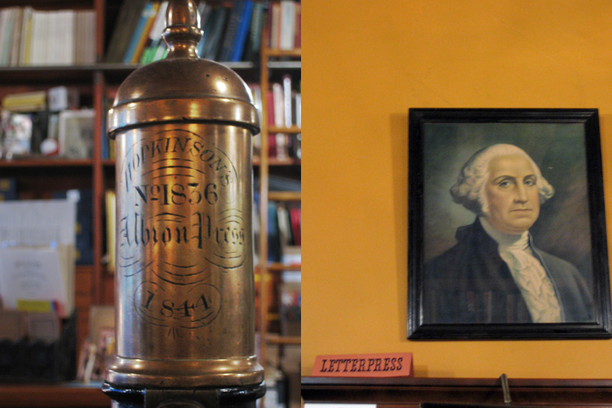
I've come upon Bowne unexpectedly, through Doug, who started volunteering there. On stepping into the shop the first time I was almost giddy. Cluttered, dim, with wooden displays and shelves lining the walls, the place appeared reasonably authentic on first view, but I knew, in New York, that was impossible. I was only slightly deflated to confirm it was a recreation. Bowne & Co. was founded in 1775; this store is a 1975-vintage evocation of a printing "job shop," c. 1875. (Bowne, the company, still exists, as a global financial printer.) The shop has an amazing collection of type both metal and wood, an assortment of curious machines of obscure purpose, many wooden cabinets and drawers, mostly askew, and fantastical piles of oddments.

Most of the oddments belong to Robert Warner th
e "master printer", curator, and character of the shop (that's him printing, above, on the shop's 1901 Golding press). Almost Seussian (or is it more Felix with his bag of tricks?) he is focussed, jovial, fond of puns, and has an air of the surreal about him. Robert is a fascinating collage- and correspondence artist and describes himself as a 'gatherer.' He scours eBay for odd lots of antique wallpaper, ancient ledgers, disbound books, 1930s catalogs, cabinet cards and other paper ephemera and he most certainly has an exuberant way with the detritus of bygone eras. I'm jealous of his inventory. He also appears to acquire people, like a set of identical twin sisters from somewhere mid-country with whom he corresponds. The twins definitely veer more toward the Tim Burtonesque: identical clothing and hair style, theatrically prim, and obsessively creative. I've not actually seen these girls in person, but they do make a very intriguing cameo in this engagingly quirky film about Robert's art.

The store is a working printing office. It is also under the auspices of the South Street Seaport Museum and as such it has the mission to 'demonstrate' the arcane processes and 'educate' the unwary public that wanders in, however few they might be.
Thankfully Bowne doesn't wholly ascribe to the Colonial Williamsburg school of 'living history' and there is no "authentic" printer outfit to wear, save for a very real printer's apron. Though one person did tell Robert, who is partial to overalls and caps, she liked his "costume." I think he enjoyed that. And so, by default, for these past many Sundays, I've been part of the show.
top photo from the South Street Seaport Museum, the rest by me!

11.25.2006

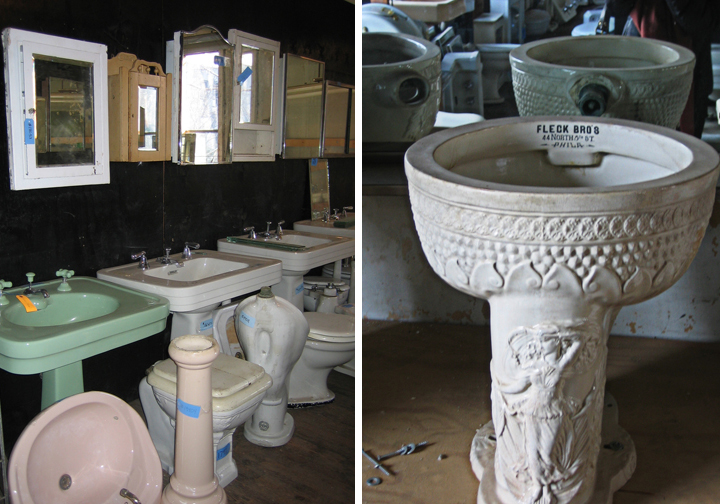
architectural salvage: the slasher movie

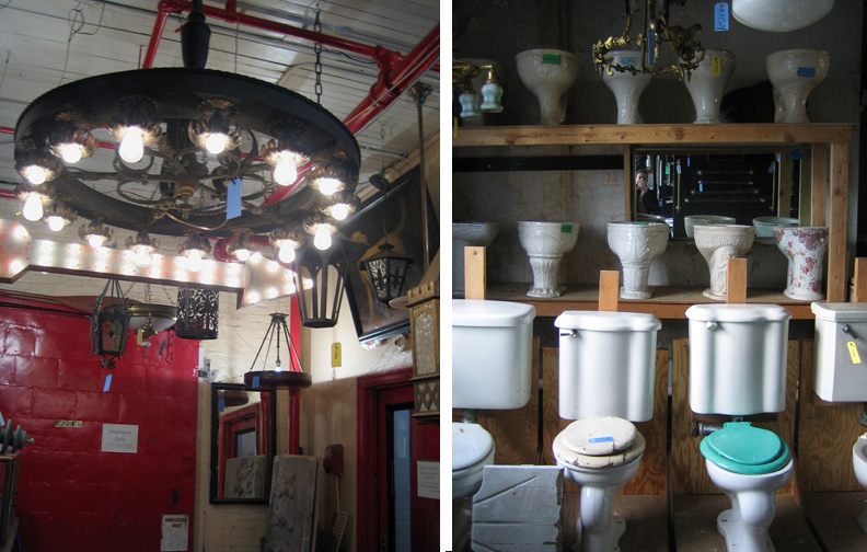
My friend Noel and I went up to Demolition Depot, an architectural salvage outfit on 125th and third Avenue. Four stories of remnants– many, many doors, sinks and toilets– waiting in darkness (lights are on motion detectors). All are obsessively catalogued; each item tagged with a number one looks up on a computer for a price, each entry documented with a photo. Areas on each floor are designated with small hanging signs saying things like, "swinging kitchen door section" or "full set French door section." The peculiarity of the place comes through in certain inventory choices: there may be a stunning, unusual item, say, a 4-foot tall wooden Art Deco chandelier nestled amongst rows of graceful early twentieth century oval sinks and then a small, corroded, emphatically not-special mirror, each tagged, photographed and recorded.

All items appear to be in the exact state in which they were found and ripped from the bowels of origin. Small traces of lives remained. A door with children's stickers, another with a sad accretion of locks and chains. Toilets dressed in furry colored seat covers. Medicine cabinets with rust rings--documents of the last can or two of shaving cream?

We got the sense that Evan, the owner, never truly wanted to part with anything. N inquired about a large, handsome print of the Singer building propped up against the counter. It was met with "That's.... [pause]... mine. Not for sale." The small, corroded, emphatically not-special mirror mentioned above, used by us as a price gauge, was $75. To visit the fireplace annex across the street one needed to be escorted. When we asked and waited for our escort we were interrogated more than once: "Are you looking for fireplaces? Are you shopping for mantels?" Ultimately we were discouraged from venturing over, fearing what a, "just looking" might incur.

Ominously we were reminded that, if we didn't see something we wanted, we should call them since they were "always taking down buildings." Always taking down buildings. That conveyed a bit more active intent than I was comfortable with. My
wistful admiration and odd sense of gratitude that someone "rescued" these items began to falter. In the Stephen King novel of Demolition Depot, Evan, sinking ever deeper into his acquisitional mania and cataloging delusions, would resort to subterfuge, landmark infringement and-- murder!--in order to take down buildings and salvage items, large and small. Then they'd remain in perpetuity on those four dark floors or "over in the warehouse."

LinkWithin

Related Posts Plugin for WordPress, Blogger...