10.23.2010

A Portrait of the Artist Pinching Himself


A contemporary remarked that this was first and probably only time the underside of the tongue has been rendered in a sculpture

For reference, here is a typical early Messerschmidt commission, Kaiser Joseph from 1765

I'd heard of the German-Austrian sculptor Franz Xavier Messerschmidt (1736–1783) several years ago—I've forgotten how—and was absolutely stunned when I saw a few of his Kopf-Stücke or "character heads." How could these have been done in the 18th century? So I made a point to go up to see the first-ever Messerschmidt exhibit in this country, now on (until January 10, 2011) at that little boutique of a museum, the Neue Galerie.

The stunning installation is by Federico DeVera, owner of my favorite store which I cannot afford anything in. The walls of the exhibition rooms are decorated with light and spidery drawing. An opulent rococo crest encrusted with scrolls and all manner of frippery, hand drawn in silvery gray graphite, opens the show. Each room thereafter has the barest ghostly intimation of sconces and panelling in outline. DeVera has a genius for stark drama.

Messerschmidt, a well-respected young Viennese sculptor, garnered a steady stream of impressive—even royal— commissions, and assumed an assistant professorship at the Academy. He produced attractive, gorgeously modelled busts, some with florid piles of Rococo drapery, others becoming notably more severe and plain. He is credited with the exemplifying earliest shift in taste to the Neo-Classical with his innovative and "reductive" portraits. At some point though he seems to have suffered some sort of serious emotional difficulty and in 1774 he was passed over for a full professorship at the Academy due to "confusion in the head."

Crushed and humiliated he left Vienna and returned to his birthplace, a small town in Bavaria. He withdrew to a small workshop,
'on the bank of the Danube, the entire furniture of which consisted of a bed, a flute, a tobacco-pipe, water pitcher, an old Italian book about human proportion and a drawing of an armless Egyptian statue.'
There he would receive visitors as he worked on a startling series of 64 "heads" that are unlike anything ever seen in art until that time. Tormented by what he called the Spirit of Proportion, Messerschmidt was afflicted with pains in his abdomen and thighs, and was haunted by nightly visitations. In some labyrinthian mental construct which he related to visitors, if he were to pinch himself in the side producing grimaces and odd facial contortions, all the while looking in a mirror, he could carve the result in alabaster or marble—thereby keeping the Spirit, and pain, at bay. In addition to stone also used tin and lead— soft metals that allowed him to etch eerily realistic details such as stubble and hairlines.

Some believe he had what today would be called a "psychotic break" coupled with unacknowledged sexual issues as he was not known to have had any relationship whatsoever. A visitor at the time reported in his diary he thought Herr Messerschmidt merely suffered from indigestion exacerbated by his superstitious nature. (I, myself, would put money on the psychotic break).

It is fascinating to note, however uncanny and singular the heads are, the many ties to the 18th century zeitgeist the works evince: caricatures become popular in art; physiognomy and other pseudo-scientific studies of anatomy, intellect and character are widespread; psycho-supernatural parlor entertainment is on the rise. It is even thought Messerschmidt stayed for a time with Franz Anton Mesmer, whose demonstrations of electro-magnetism induced mild convulsions in his patients.

Had Messerschmidt not experienced his mental torment his art might never have strayed into such radical and 'modern" expression; he probably would have been relegated to a passing mention, if that, in art history surveys. He died of unknown causes at the age of 47.
An influence? The compact intensity of Roman busts or, above, an Egyptian portrait head of about 400-500 BC

10.20.2010

Underground uncovered


A disused section of the Notting Hill Gate tube station in London, walled off since about 1958-59, was recently uncovered during maintenance and construction. The area is a former elevator passageway which was blocked after escalators were installed. The advertising posters are more colorful and evocative of their time than one could even hope for. In fact, if I were a set designer and I did this I would probably think, "Hmm this is trying too hard to be 'period.'"
Photos by Mikey Ashworth for the London Underground (see more on his Flickr page)

Although this happened quite a few months ago I've only now just found out, courtesy Sam Markham, a
friend with incredible scouting skills.

This made me think about my post about my collection of dry cleaning posters... the art work used currently is typically 25-30 years out of date.

10.11.2010

Alexander Anderson: master engraver, nice guy


Alexander Anderson, 1818 by John Wesley Jarvis. Doesn't he just look like a sensitive guy in this portrait?


I am particularly fond of Anderson's plain old commercial work and lettering.
Also, winsome yet unsettling tailpieces and vignettes like the two immediately above, and children's primers (like "dunce" above)
influenced Edward Gorey's style of illustration.

In rooting around today, attempting to do some research on engraving for a new book, I came across the massive and awe-inspiring collection of work by Alexander Anderson. Anderson (1775-1870) is considered one of America’s earliest and finest wood-engravers (completely different from the steel bank note engraving I was looking for and thus, of course, I spent my entire day perusing unrelated materials...), similar in style and artistry to the great (earlier) British engraver Thomas Bewick.

Born in New York City to Scots immigrant parents Anderson was completely self-taught. In his young adulthood he made and sold engravings in his spare time to help finance his way through the Columbia medical program. He married early, and practiced medicine only briefly, giving it up and turning to engraving full time when his wife and infant son died in a yellow fever epidemic in 1798. He remarried and went on to have six children. It is through his family that some of his original work --proof scrap books and original artwork, some tools--was saved and handed down (evidently with touching marginalia like "I saw Grandpa make this, Spring 18xx, when I was 10"), eventually residing in the New-York Historical Society.


True to form, the Historical Society has nothing online and the items are likely collecting dust in their acid-free, archival sarcophagi.
The New York Public Library, on the other hand, has a truly magnificent and overwhelming digital archive of sixteen of Anderson's scrapbooks, containing close to 10,000 wood-engraving proofs of his work for books and journals but also for business letterheads and other commercial ephemera. He drew everything: anatomical illustrations, children's primers, Egyptian scenes, steamships, slave scenes, polar bears, printing presses, lottery tickets, domestic parables, factories, famous men in history, scenes from Shakespeare, and labels for toothpaste. Anderson's work spans an incredible seventy years— he made his last engraving in 1868, at 93 years of age— and it's amazing to see the stylistic changes in dress, transportation and lettering styles.

updated:
I've posted a few of his simple vignettes and commercial lettering only since I find those most evident of hand craft and the most poignant, really. Everything he did seems to have an effortless charm and impeccable execution —even lowly commercial work. All this craft and beauty for utterly inconsequential things like pins; an artisan of the throw-away.

10.05.2010

A man named "Named", and other names...*

above, two sources of names for the Lexicon of Greek Personal Names. The example directly above is a gravestone for "Zosime, daughter of Herakleon", from Syria, late 1st century B.C. The hands on the stele symbolize her relatives' vow to avenge her death which was apparently not a natural one.
First, if you don't regularly visit Arts & Letters Daily you ought to. Its like a cultured news aggregate: The front page has regularly updated links and brief teasers for essays, reviews, investigative journalism and opinion pieces from a varied and international roster of publications and sites.

And so it was on one of my perusals of A&LD that I came across a delightful review of "A Lexicon of Greek Personal Names, Vol. V. A Coastal Asia Minor: Pontos to Ionia edited by T. Corsten" in the London Review of Books. The Lexicon project (it's a site as well as publication):

traces every bearer of every name, drawing on a huge variety of evidence, from personal tombstones, dedications, works of art, to civic decrees, treaties, citizen-lists etc., as well as literature, artefacts, graffiti etc.
A staggering thought: someone compiled a register of all ancient Greek names that were permanently recorded on "paper" or stone, from the age of Homer to early Byzantium.

And God love the British, the review of the book runs to approximately 5600 words. Doesn't sound very promising ... But
in fact the reviewer James Davidson, an academic who makes something of a specialty of writing about the odder corners of ancient Greece, offers up a witty and expansive background essay of names and naming in England before moving on to the Greeks.

I have always been intrigued by fashions in naming (whither Dorcas and Edna?) and oddities of conception (see Puritan names below) so I found Davidson's essay extremely informative and fun. He notes the liberality and inventiveness of naming in English-speaking countries. Moon Unit Zappa, Trig and Track Palin and assorted Hennessys, Apples and Prince Michaels et al. are "self-conscious expression of an assumed freedom to name children whatever parents want." By way of contrast he cites an Italian couple wanting to name their child Venerdì (Friday). A judge, having refused to allow it, renamed the kid Gregorio. Until recently some other countries, notably Germany, Sweden and Denmark, had maintained lists of approved names!

He goes on to relate the dramatic upheaval in English naming after the Norman Conquest. With the ensuing influx of French and other Romance languages native names such as Aethelwulf, Aethelflaed, Frithuswith, Ealdred go the way of Grendel, being rapidly
replaced with Geoffreys, Henrys and Eleanors. Davidson uses this episode to explain label names versus transparent names— terms I'd never heard before. A label name would be, for example, Geoffrey (or Geoffroi). It doesn't give you much information to go on—especially if you don't speak French and not even the sounds are familiar. To a post-Conquest Briton Geoffrey is opaque. By contrast the native speakers used transparent monikers–which literally meant something to native ears–like Aethelflaed, ‘Noble Beauty,’ or Aethelraed, ‘Noble Counsel.'

In this, the Anglo-Saxons were very much like the Greeks whose names in large part
mean something. This made me think of Native American names and the strange convention we have of translating some: Tashunka Witko is known to us as ‘Crazy Horse’, Tatanka Iyotake is ‘Sitting Bull’—but leaving others to be merely transcribed: Sacagawea or absurdly, even Tonto. The translation into everyday English words makes the names paradoxically alien and somewhat ridiculous. Anglo-Saxon and Native American names are transparent and Greek ones are similarly transparent in the native language. If we translated the ancient Greek names as we do Indians' we'd come across 'He Who Loves Horses’ (Philip), ‘Masters (with) Horses’ (Hippocrates), ‘Flat-Nose’ (Simon), ‘Stocky’ or 'Broad' (Plato), ‘Famed as Wise’ (Sophocles) and Peace (Irene).
Greeks seem to have taken pleasure in making up names:
Epic poetry is full of names, a fair number of which must have been made up by the poet... In Theogony Hesiod names 50 nereids in a virtuoso performance of nearly abstract prosody: Sandy, and charming Salty, and lovely Promontoria, Goodmooringia, Welcome-Wave, Current-Carried etc.
How different would our conception of Plato be if he'd come down to us as "Stocky"? //


Not discussed in Davidson's review is the incredible panoply of names in America starting with the extraordinary and singular inclinations of the Puritans. Religious Dissenters (like those who emigrated to New England) took to Old Testament names (whence your Hezekiahs and Mehitabels) or they made them up as they went along (keeping God in mind at all times, of course).
If you feel up to wading through it, the jocular Curiosities of Puritan Nomenclature (1884) by Charles Waring Endell Bardsley is the place to find out about all those Temperances, Fear-nots, Hope-stills and Preserveds (see above).

The index of names is amazing.


* From the
Lexicon of Greek Personal Names: Onomastos ("Named") was a man from Smyrna in modern day Turkey.

9.26.2010

Beach Frolics, 1921

click for much larger images


Oh dear, first I got waylaid with work , then technical difficulties. Herewith a quick post of my latest purchase: a double-sided page of beach snapshots. One thing that never fails to send a shiver through me is the sight of all that wet and sandy wool knit on people. How was it possible that beach-goers slogged thru surf and sand in 90+ degree heat covered in dark leggings and tunics? Recently I was in a vintage store that had 2 pristine late 1920s tank suits: one men's, one women's. Both were charcoal gray and sweater weight. The distinguishing feature was that one had daring cut-outs on either side— that was the men's. I actually think some of the women's tunics, rolled knee socks and lace up bathing shoes are rather appealing— as autumn day wear...

A few men in these photographs are wearing tank suits that say "Ocean Tide Baths." With a little googling I find that this might have been out at Coney Island.
Evidently several bathhouses along the boardwalk with salt water pools, lockers, steam rooms, and even dance areas, were big teenage hangouts. I've found a few scattered reminiscences specifically of Ocean Tide, from the early 1950s.
Many times we went to Ocean Tide pool. I can still smell the steam bath my mom made me go into with her. The maze of grey wooden lockers we changed in. The steam room was a ritual we did at the end of the day before we went to the enclosed dance area with the wooden floor.

The Bay Ridge Lindy...was popular among the boys from Bay Ridge who danced at Ocean Tide. They’d swing their arm and then bring it up to the shoulder and that was basically the difference from the ordinary lindy that we knew!

I remember dancing at Ocean Tide….jukebox…6 plays for 25 cents!
Back with more substantive stuff next post.

9.15.2010

Edwin is getting careless

I read this New York Times piece about an incredible book project my friend Paul is in the midst of (that I did not know about) and I'm jealous. Briefly, Paul acquired over 300 report cards-cum-tracking documents dating from the 1910s through the 1930s from the Manhattan Trade School for Girls. Each dossier records physical measurements, family and ethnic facts, observational commentary, and has a small passport photo-like portrait. Each is a palimpsest of notations, crossings-out, updates and tantalizing glimpses of social and cultural history. Paul is deploying his obsessional researching capabilities and is attempting to track down the life paths indicated on these cards. How did the girls turn out? Where did they go? 

The cards are poignantly forward-looking (this girl has these promising traits, she can become X) yet at the same time the modern viewer looks back on them as fossil records of a long ago time. The journeys they portend are already finished—whatever the girls were to have become either came to fruition or not. And surely in virtually all cases, the "girls" are already dead.

The article made me think of my own collection of report cards— all of one student—which I picked up at a flea market several years ago. My cards, far less interesting or informative, are the spotty school records, 1911—1921, for Edwin Lawrence. He attended P.S 164 and, later, Manual Training High School (now John Jay High School, just a few blocks from where I live) in Brooklyn. The cards are sad documentation of Edwin's slide from A's and B's in elementary school to his dismal showing in high school. Racking up 40's and 50's, failing hygiene, what on earth went wrong with this kid? His one shining moment appeared to be a strikingly incongruous 90 in music one semester. Perhaps if he had guidance, music might have led him out of his desultory adolescence.

9.09.2010

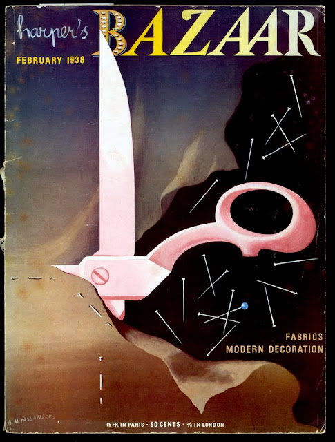
au courant, 1938

cover by AM Cassandre
Mies van der Rohe, noir style. The "famous German architect" was making his first visit to America. "He says that we should no longer be slaves to hour furniture and trappings: they must serve us."
"modern French decorating fabrics" painted by Cassandre
"black crepe cocktail dress, full skirted for the rhumba" shown with "gold and diamond cactus leaves" and fishnet stockings. The Surrealist hi-jinx in this photo was created by George Platt Lynes

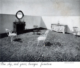
"The amazing penthouse terrace of Carlos de Beistegui" sits atop his apartment built by Le Corbusier
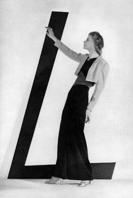
"Lelong's rampage of color." Brown velvet skirt, red sash, green top and yellow bolero—with b/w images how am I to know if this is an abomination or an ingenious expansion of the boundaries of taste?
above and below, some fashion images with a surprisingly modern edge. Those crazy Steampunk goggles the gal has on are called "Deauville blinkers" in the copy
I've found myself in possession of a February 1938 issue of Harper's Bazaar (this was a special fabric and decoration issue of the magazine) for a project I'm working on, and its quite an eye-opener. I've posted a couple times on my preference for the days when fashion magazines used more drawing and painting (and less celebrity-mongering)—and this particular issue has a fluid mix of art and photography. That's a Cassandre cover at top and another painting of his illustrating featured decorator's fabrics. Many photographs by George Platt Lynes add to the Surrealist sensibility that makes its way into the magazine. 

I like the editorial tone: there's a madcap, determined joie de vivre about it. I cant help hearing Myrna Loy as I'm reading. There's an edition of the famous Diana Vreeland column "Why Don't You..." where she tosses off suggestions like having "Vertes of Paris paint you the gayest possible fire-screen." And a feature article on the Surrealism-inflected Beistegui residence in Paris coos about the "modern Fantastic" and "glorious hodgepodge" in rapturous prose. This, of course as the Depression dragged into its 9th or so year.

Random observations:
• It is interesting to see images that are noticeably "fashion-forward." For instance, I can see the 1940s from that "rhumba dress" above. Then, mixed in are plenty of advertisements and lesser fashion features that have a flowing silhouette lingering from earlier in the decade.
• Its disconcerting for the modern viewer to look at b/w images of fashion and have to read about the riot of color these outfits are recommending (see Lelong dress above). How do I know if this is an abomination or an ingenious expansion of the boundaries of taste?  That said, its even more impossible for the modern eye to interpret the stylistic merits and purchase-worthiness of shoes from a drawing.

LinkWithin

Related Posts Plugin for WordPress, Blogger...