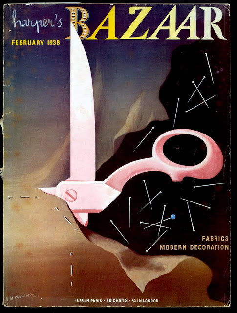
 |
| cover by AM Cassandre |
 |
| Mies van der Rohe, noir style. The "famous German architect" was making his first visit to America. "He says that we should no longer be slaves to hour furniture and trappings: they must serve us." |
 |
| "modern French decorating fabrics" painted by Cassandre |
 |
| "black crepe cocktail dress, full skirted for the rhumba" shown with "gold and diamond cactus leaves" and fishnet stockings. The Surrealist hi-jinx in this photo was created by George Platt Lynes | |
|
|
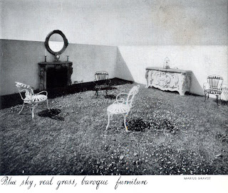 |
| "The amazing penthouse terrace of Carlos de Beistegui" sits atop his apartment built by Le Corbusier |
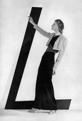 |
| "Lelong's rampage of color." Brown velvet skirt, red sash, green top and yellow bolero—with b/w images how am I to know if this is an abomination or an ingenious expansion of the boundaries of taste? |
 |
| above and below, some fashion images with a surprisingly modern edge. Those crazy Steampunk goggles the gal has on are called "Deauville blinkers" in the copy |
I've found myself in possession of a
February 1938 issue of Harper's Bazaar (this was a special fabric and decoration issue of the magazine) for a project I'm working on, and its quite an eye-opener. I've posted a couple times on my preference for the days
when fashion magazines used more drawing and painting (and less celebrity-mongering)—and this particular issue has a fluid mix of art and photography. That's a
Cassandre cover at top and another painting of his illustrating featured decorator's fabrics. Many photographs by George Platt Lynes add to the
Surrealist sensibility that makes its way into the magazine.
I like the editorial tone: there's a madcap, determined joie de vivre about it. I cant help hearing Myrna Loy as I'm reading. There's an edition of the famous Diana Vreeland column "Why Don't You..." where she tosses off suggestions like having "Vertes of Paris paint you the gayest possible fire-screen." And a feature article on the Surrealism-inflected Beistegui residence in Paris coos about the "modern Fantastic" and "glorious hodgepodge" in rapturous prose. This, of course as the Depression dragged into its 9th or so year.
Random observations:
• It is interesting to see images that are noticeably "fashion-forward." For instance, I can see the 1940s from that "rhumba dress" above. Then, mixed in are plenty of advertisements and lesser fashion features that have a flowing silhouette lingering from earlier in the decade.
• Its disconcerting for the modern viewer to look at b/w images of fashion and have to read about the riot of color these outfits are recommending (see Lelong dress above). How do I know if this is an abomination or an ingenious expansion of the boundaries of taste? That said, its even more impossible for the modern eye to interpret the stylistic merits and purchase-worthiness of shoes from a drawing.


No comments:
Post a Comment