12.24.2011

autochrome christmas

MERRY CHRISTMAS
&
HAPPY HOLIDAYS TO ALL.
 thank you for reading or just stopping by!
Autochromes c. 1920s by Charles Zoller.  Zoller (1854-1934) was a successful furniture dealer and prolific amateur photographer from Rochester, NY. On a trip to Europe in 1907 he became acquainted with the brand new autochrome process and started photographing in color. He documented life in Rochester and recorded journeys across the country and in Europe. The George Eastman House, International Museum of Photography and Film, in Rochester, houses approximately 3900 Zoller autochromes. While many betray Zoller's seeming fascination with photographing trees, flowers and close-up portraits of citrus fruit, the selection online will reward the patient viewer. 

12.18.2011

awkward

The clumsy Chippendale crest shape is a spot-on evocation of the strenuous efforts of a journeyman sign maker, c 1780s.
This sort of lettering puts us squarely in the second quarter of the 19th century
As much as it appears otherwise at first glance, the signs here are not the stock of some high-end Americana dealer. They were all created by Heidi Howard, a Rhode Island School of Design graduate, in her Eastford, Connecticut studio. The boards are actual aged wood planks whenever possible, and the hand-painted and lettered signs are assembled with antique hand-cut nails. The whole duly aged and weathered and... We've entered dangerous territory here haven't we? A knowing, labor-intensive recreation of an ostensibly serendipitously found naive, ephemeral object? Kitsch or cuteness? I'm torn. I'm genuinely drawn to many of these—I love the awkwardness.* Taken individually, the aesthetic spirit conjured is quite beautiful. The decorative shapes and silhouettes look suitably like the earnest efforts of a rural journeyman sign maker c. 1800. The lettering, punctuation, and spacing is near pitch perfect. The research and historical knowledge is emphatically there. And yet I wouldn't be wholly surprised to find one in a Massachusetts TGI Fridays. Which makes me sad. // All signs by the undeniably talented Heidi Howard

* “naive” and primitive lettering and figures like this can be found on gravestones (see here and here). Several of Ms Howard's signs take cues from the spindly, hesitating lettering of early and mid 18th century, elsewhere she takes on the look of the “fat face” and decorative letters of the 1830s.

12.15.2011

color me impressed

This morning I woke up repeating "Stygian Black".
Stygian is the adjectival form for the mythological River Styx... as in the boundary of the Underworld. Scary sounding dream, right? EXCEPT in the dream I was saying it in the context of some fashion, color-naming brainstorming session. Thus, it was actually some sort of wish fulfillment... because I've always wanted to get paid to be a color namer for paint. Here, a good color (re)post from the archives:

I just read a book I'd gotten months ago and promptly forgot about, "Color: a natural history of the palette" by Victoria Finlay. The author, a British journalist living in Hong Kong, sets out to explore the origins--historical, cultural, physical-- of pigments and dyes. The book,
organized loosely by color swatch, is sometimes weighted down with her travelogues of traipsing off to China for fabled greens or meandering through Afghanistan in search of ultramarine mines. But what, early on, had annoyed me to the point of putting the book on the shelf: the chatty, lady's magazine lightness proved to be less of an obstacle as the book wore on. I tend to like bits and pieces, historical oddities and unraveled edges and it certainly provides just that.

In the book,
color, something we think of in benign almost frivolous terms (pink or blue case for your cellphone), takes on gritty physicality, volatility, even toxicity. Metals, stones, berries, bark, insects, shells are ground, smoked, burnt and acidified. Through distilling and decanting, arcane alchemical processes produce miraculous results.

The often harsh paradoxes of the material form of color are amazing. Velvety rich blacks rendered from oak gall, soot, and charred bone, brilliant reds from beetles, pristine white from a red dust.
Fugitive and unstable, there's an almost spiteful nature to unfixed color-- saintly whites turn black, brilliant reds fade to sickly pink, and puritan blacks that turn a disturbing orange. The almost allegorical danger inherent in many of these colors is fascinating as well: lead white, used extensively in cosmetics and paint and prized for its transcendent luminosity, caused "plumbism" and slowly destroyed one's liver, kidneys and mind. Arsenic used to fashion Scheele's Green, which accented Napoleon's wallpaper on St. Helena, may have contributed to his death.
---
Here's where one can learn a bit about wonderful things like Gamboge, Mummy and Orpiment:
• Museum of Fine Art Boston: conservation and art materials encyclopedia
• Also, a paint-making site.---
images: I'm obsessed with paint color chips-- the typology aspects, the naming, the...prettiness. At top are some Benjamin Moores, below Farrow & Ball (a company I've written about before, in one of my favorite posts from a simpler time); a weaving color/pattern sample book made in 1763 by John Kelly of Norwich, England, from the Victoria & Albert Museum; powdered colors for painting on velvet, 1814, also from the V&A. The three bottles are labelled 'Ackermann's brilliant carmine', 'W H Edwards's lilac purple', and 'W H Edwards's sunflower yellow'.; three of five bottles of dye powder I found when a dye works was being dismantled on Spring and Thompson Streets around 1998, if you can believe. They are from 1951-54 and are labelled things like "Benzo Fast Yellow" from appealing, monolithically-named companies like General Dyestuff Corporation and National Aniline Division of the Allied Chemical and Dye Company.

12.11.2011

Empire state of mind


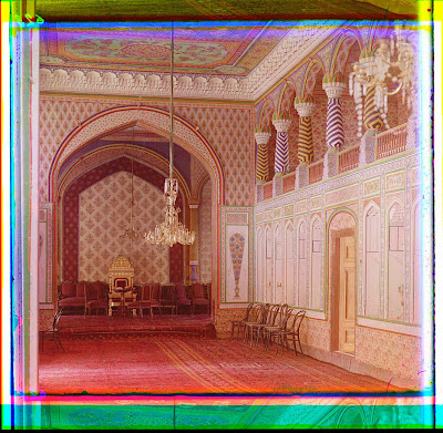
Samarkand
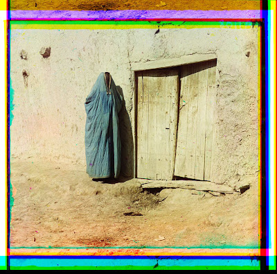
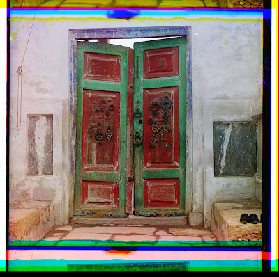
Bukhara
Bukhara.
(I see here some historical precedence for the Bukharan McMansions of Queens)
Armenian woman
carpet seller (detail)
fruit seller (detail)
Bukhara
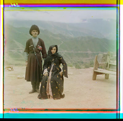
above two, typical natives of Dagestan
Sergey Mikhaylovich Prokudin-Gorsky (August 30 1863 – September 27, 1944), the photographer behind all of these images, was a Russian of noble extraction who studied chemistry under Mendeleev (creator of the periodic table). Moving to Berlin for more study, Gorsky applied his scientific background to photo chemical processing. He developed a pioneering method of creating color slide film and color motion pictures, and eventually garnered patents in Germany, England, France and Italy.
His process used a camera that took a series of three monochrome pictures in sequence, each through a different-colored filter. By projecting all three monochrome pictures using correctly colored light, it was possible to reconstruct the original color scene. (wikipedia)
Around 1905 Gorsky started devising a plan to systematically document the vast diversity of the Russian empire. Accomplished and well-connected, he was invited in 1909 to make a photographic demonstration for Tsar Nicholas and his family. The presentation went over so well that the ill-fated monarch gave Gorsky a specially equipped railroad-car darkroom, two skeleton key permits granting him access to restricted areas around the empire and cooperation from the far-flung bureaucracy. Suddenly, his herculean project became possible. Gorsky documented the Russian Empire from 1909 through 1915, and gave photo lectures thereafter. He eventually fled the country shortly after the Revolution, with the authorities confiscating about half his archive because of purportedly “sensitive material”.

After settling in Paris, Gorsky stored the remainder of his photographs and fragile glass plates in the basement of his apartment building. A few years after his death, in 1948, the US Library of Congress purchased the material from his heirs for $3500–$5000. Outside the Library of Congress collection, nothing else of Gorsky's work has yet been found.
Sergey Mikhaylovich Prokudin-Gorsky in 1912

11.29.2011

Tuesday with Mori


Oh sorry, that title's a really bad pun.

I came across the
Farber Gravestone Collection, a photographic resource
of 13,500 images documenting the carving on old gravestones and my heart did a leap. Oh so long ago I made a little book about gravestone carving for my senior project. It was mainly a graphic design exercise on the changing iconography of gravestones, but the text came out of a paper I wrote for a history class. What a help this collection would have been! The photos existed (most images the Farbers, a husband and wife team, took were from the 1970s and 80s) but they were on a shelf somewhere in the American Antiquarian Society and without the power of the internets, I was Farberless.
I knew that formally, Colonial graves had headstones and footstones, like a bed for the occupants' everlasting repose. This idea also lent the markers their distinctive headboard shape. What I learned was that they typically had carving on the outer sides of the stones, so the visitor-reader would not tread on the grave. Also, graves were positioned with occupants' feet to the East, so that come Judgment they would stand to face the rising sun.

Skulls, Death's heads, cherubs, hourglasses-- the symbols were often copied directly from engravings that came over from England. These were then copied again and again by dedicated stonemasons or itinerant carvers, mostly without the benefit of reference to the original design. Changed, embellished, streamlined and mutated by skilled intent or by lesser hands, the imagery is at once repetitive and wildly divergent. Truly bizarre figures emerge. Wings become decorative swirls, collars, mustaches. Leering Death's heads become benign cyphers, cherubs morph into strange stupefied-looking sexless trophy heads. Once the Puritan ethic loosens its grip, attempts at portraiture get added into the mix and things got really interesting. When the fashion for Neo-classicism trickled down to the gravemarker, winged messengers were supplanted by urns, willows, swags and often, a disembodied hand pointing skyward.
The inscriptions, too, can be fascinating in all their mangled phonetics and "ye Olde"-iness. Sometimes creepily elliptical ("RB. di'd 1712"), or filled with florid religious boilerplate, they can sometimes stop your heart with personal, real, specificity. At top, little Aaron Bowers, aged 2 years 10 months, was "instantly kill'd by a stack of boards" on September 12, 1791. And there he is, splayed out behind two planks.

My Trembling Heart with Grief overflows,
While I Record the death of Those;
Who died by Thunder Sent from Heaven,
In Seventeen hundred and Seventy Seven


Abraham Rice
struck by lightening
1777

Framingham, Massachusetts

11.28.2011

can you hear me now?


Oh, it's taking me forever to write my next post!
In the mean time
, a repost, with updates:
Recently I said to a friend that I found the recorded subway stop voices disappointing. Granted, the announcements are audible and intelligible but still. The hyper-enunciating, the shaky emphasis: these are not New York voices! Each time the "Q" and "B" woman in Brooklyn swallows "'DEE-kulb' Avenue" I grit my teeth. (It's "de-KALB" or "DEE-KALB" for emphasis.) Its like the staff of some mid-West hotel got into the control room. Keep local color in NYC!

Does anyone remember when taxis started playing announcements in the mid-nineties? The very first debut recording of these was in circulation for only a few months but it was a doozy. It
incorporated a voice of such stupendous color, such unaffected Outer Boroughness, such unintended hilarity that it is seared into my brain. (I regret there isnt an audio file I could find):

"Please make shoo-aw ta take awl of yaw belawngings, and dohn fuget to get a receipt frum tha dry-vuh.
"

The woman behind the voice (a secretary at the place that made
taxi meters) was pressed into service in a move of stunning naivete and sheer serendipitous brilliance. She became a brief pre-social media celebrity. If that happened today she'd have fan pages, followers and a reality series contract. //

I was barely reading an article in the Wall Street Journal about cell phone problems when, in a section about sound quality, I came across the intriguing term “Harvard sentences.” Evidently cellular systems engineers actually travel around the country testing signal quality-- somewhat like the familiar Verizon "can you hear me now" guy-- by sending out aural snippets known as Harvard sentences:

a collection of phonetically balanced sentences that measure a large range of different qualities in the human voice. These were originally published in 1969 as the Institute of Electrical and Electronics Engineers recommended practice for speech quality measurements.
The sentences go a little something like this (in random selection):
"She has a smart way of wearing clothing. These days a leg of chicken is a rare dish. Cars and buses stalled in snow drifts. Both lost their lives in the raging storm. The pencils have all been used. The stale smell of old beer lingers. The beetle droned in the hot June sun. A gold ring will please most any girl. When the frost has come it is time for turkey..."
Sort of open-mic beatnik free verse, no? I have the mental image of someone in a fluorescent-lit cubicle reciting all 200 sentences with overly precise diction into a large reel to reel tape recorder. No indication as to how they were named but I would guess Harvard is the stand-in for the concept of a precise ideal.

So I started thinking about pronunciation and the classic tone and phrasing found in movies and newsreels of the 1930s and 40s. Listen to
Katherine Hepburn, William Powell, Cary Grant, and notably, FDR whose "fear" was rendered as "fee-ah." Where did that manner came from, and more importantly, where did it go? I've found that what I've been talking about here is called "Mid-Atlantic English" according to wikipedia:
a style of speech formerly cultivated by actors for use in theatre, and by news announcers...institutions cultivated a norm influenced by the Received Pronunciation of southern England as an international norm of English pronunciation. According to William Labov, the teaching of this pronunciation declined sharply after the end of World War II.
It's a little New England, a little gin & tonic at the yacht races, with a dash of "thee-ay-tuh."

Little Edie Beale in Grey Gardens and any appearance by William F Buckley were
probably the last times I heard a version of this pronunciation. And what about its socio-economic and narrative opposite, the Toity-toid an' Toid /James Cagney New York Gangsterese? Hearing them creates as much a sense of temporal distance ("This is not now, I'm listening and watching something from the past") as the b/w of old footage or the style of period clothes...///


Amazing sound resource here

A civil war soldier remembers his experience on the morning Abraham Lincoln died.

11.11.2011

recent acquisitions*

Saranac Lake, Adirondack Mountains, NY, c. 1905
I love crude old color lithography—
the kind that is made up from visible dots of poorly registered color.
With its oddball woody frame I think this might be one of my favorite postcards ever...
///  ///  ///

I've convinced myself that the mounted photos, below, are fairly interesting.
I plucked them from a big pile of mess, along with a few klunkers (on further consideration)
and couple mangled prints for $20 total. The lady was actually surprised that I just handed over the bill
without a protest, so maybe I overpaid. ha.
"Seneca"
Who knew Seneca looked like a haggard beggar?
I guess dealing with Nero and being forced to commit suicide will take its toll.
"Balbo figlia, Museo di Napoli" by Roberto Rive (embossed stamp), c 1870s
Marcus Nonius Balbus was a governor of Herculaneum—and this must be the family!I find it funny that this kid's head is so inflated. A bulbous Balbo.
The Pantheon, Paris, and detail, by Albert Mansuy, c1860s
This site, which is selling this exact same albumen print for 32 euros, says,
"Albert Mansuy had a little studio in Paris and sold his work to Martinet retailer, rue Hautecoeur, Paris.
Scarce, rarer than Quinet, Levy, Neurdein & other studios."
The details are pretty great—Its 4:15 and the advertising kiosk features chocolate and "toothache" remedies
Pluto and Proserpina (Bernini)
*If you'd like, see other "Highlights from the Collection": A sporadic series of posts focusing upon some object or series chosen from amongst the piles in my apartment. A spotlight thrown on things curious or engaging in their unremarkableness.

11.07.2011

Astuguevieille

Saulorme chair
Moiste chair
limited edition mirror for Couturelab
two images above, Elle Decor Spain
Tactoris commode, 2008
image by Diane Pernet— from her wonderful fashion world blog
image by Diane Pernet
he also does sculpture in bisque for Sevres!
black painted cotton rope and raffia on wood
cotton rope on wood with gold leaf (I believe)
I just read a wonderful piece on the New York Times T style site about artist Christian Astuguevieille. I'd never heard of him before but I now believe I love him. Except for the fact that he is perhaps a tad senior for me, is in another country, and is gay—he's my ideal man. He is a furniture designer, sculptor, collector, and the "nose" behind many of the intriguing fragrances produced by Comme des Garçons. (I have Avignon, from the Incense series, described as Gothic, "tapestries imbued with centuries of incense... with an almost eye-smarting, gloriously smoky and resinous heart") As a bonus, he seems partial to crisp white shirts (nice!) and his house in the south west of France appears to be fairly enchanting as well.

“Altering and deforming the original use of things is important to me.” Astuguevieille's work is informed by Japanese wabi-sabi (which I've briefly touched on a couple times before) and furoshiki (the art of wrapping objects in cloth bundles), but also tribal and cycladic forms. Now I'd like to know how to correctly pronounce his name.
see more at
Franziska Kessler gallery and Holly Hunt

LinkWithin

Related Posts Plugin for WordPress, Blogger...