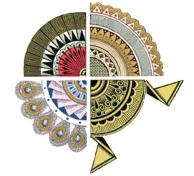


 Over the past several months I tried to forget my failings here by losing myself, instead, in the long-term project Doug and I have have been slaving over:
 The Handy Book of Artistic Printing
A Collection of Letterpress Examples
with Specimens of Type, Ornament,
Corner Fills, Borders,
Twisters, Wrinklers, and
other Freaks of Fancy
A Collection of Letterpress Examples
with Specimens of Type, Ornament,
Corner Fills, Borders,
Twisters, Wrinklers, and
other Freaks of Fancy
Our book is published, a web site is coming soon, a postcard is on the way and
A background note: The history of design has, with just a few notable exceptions, skipped over the late nineteenth century. One could be forgiven for believing that the history of design and publishing went something like this:
Gutenberg... Caslon... William Morris....French advertising posters... Modernism....
We did what in publishing jargon is sometimes called a "micro-history." Instead of Cod or Salt we chose Artistic Printing, the elaborate style of commercial letterpress printing popular ca. 1870s-1890. We've taken a piece of obscure cultural arcana and tried to reason that, well, it's not so obscure after all— or it shouldn’t be. Artistic printing was popular taste. It drew upon, and helped perpetuate, motifs that show up in other decorative arts of the time. In certain ways the style allowed for, and encouraged, design freedom and experimentation. Artistic printing showcases some of the more adventurous typographic play made to that date and many of the oddest conceptions of page arrangements ever.
Since it was allied neither with high art or nor fine book publishing, there has been an academic snobbism about this style’s commercial “taint.” That is changing...


7 comments:
looks wonderful!
Bravo, Angela! Can't wait to see it. It's true that this has been a very neglected area in design history, but its influences were pervasive. There has been one important revival of this artistry that's been active for the past thirty years: an international group of commercial signage designers and artists have revived the styles and techniques of the reverse-glass painted signage of 90 to 120 years ago. You may want to see one of their websites, www.theletterheads.com, and many of their members will certainly be eager to see your new book. Thanks for your good work.
I picked up this book yesterday, and it's practically made for me! Thanks for working on such an amazing compendium of unique style.
Hey Thanks everyone!
We're very excited you liked the book Dot! I'm going to put some new stuff up and link to our artistic printing blog, too.
We hope to have more in-depth discussions about oddities we've found as well as musings about 19th century type, design and ornament.
whee!
Added to my birthday list!
Love it!! but that's no wonder. I'm a big Art nouveau fan (love Arts&Crafts, japonisme as well).
Continue those micro-history, I know a lot about European decorative arts but far less about american.
Angela - Malcolm Enright in Australia, are you aware that John Foster on his blog has also given the book a plug?
Here: http://accidentalmysteries.blogspot.com/2009/07/freaks-of-fancy.html
Post a Comment