1.29.2012

not your grandma's Victorian

perhaps a Josef Hoffman? No! its from 1867!
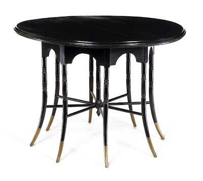
table by Godwin, 1876. those brass tipped legs!
It's not 1950s Blenko, its 1890 Dresser!
folding chair by Godwin, 1875
chair, Godwin, 1883
chair, Dresser, 1880-83
toast rack, Dresser, 1878
occasional table, Godwin, 1876
Christopher Dresser
Edward William Godwin
Update:  I got a great book suggestion from reader Will Chandler: Nineteenth Century Modern: The Functional Tradition in Victorian Design by Herwin Schaefer, published 1970— a rather early foray into this kind of serious study of Victorian design.
Will elaborates:
His book focuses on the mostly vernacular and mechanical objects made in Europe and the United States (some as far back as the 16th Century)  that inspired many of the early design reform theorists, and outlines their responses to and comments about these sources. The book is heavily illustrated and I've never seen a better exposition of this topic.
Schaefer was the first Design Collection curator at MOMA— so this sounds excellent. It's already on its way to me!

Also, somehow I've managed to be unaware until now that there is an exhibit on “19th century Modern” at the Brooklyn Museum. I marvel at my obliviousness sometimes. I will append any thoughts I have on the exhibit here. //

The other day I came upon a post about architect and design reformer Edward William Godwin (1833 – 1886) on an appealing interiors and design blog called Hunters & Gatherers at Home. I already knew about Godwin, but H&G’s post really reminded me of the revolutionary quality of some of his work. Also included here, the more famous polymath Christopher Dresser (1834–1904). I think these pieces are astonishing.

Godwin picked up architecture on his own. Dresser studied at the then brand new (and oddly fascist sounding) Government Schools of Design. Created in 1837 to better integrate science and art, the school's aim was to improve design for industry and manufacture. Can you imagine? In this country people were too busy displacing Indians, preserving slavery and clearing brush to care about something as rarefied as design. (Perhaps I overstate.)

Godwin steeped himself in Gothic Revival for a time but both he and Dresser really found themselves when they discovered Japanese crafts and decorative arts. Japan opened to trade with the West in 1853, and suddenly Japanese items flooded the market. All the design reformers, artists, and Aesthetic hipsters of the time went Japan-mad. It remained a cultural influence through the rest of the 19th century.//

 Godwin created the crazy sideboard at top in 1867 for his own home. He explained:
"When I came to furniture I found that hardly anything could be bought ready-made that
was at all suitable to the requirements of the case. l therefore set to work and designed a lot of furniture...."
Lest you need reminding, this is the type of thing Godwin might have felt wasn't quite right:
cabinet, Herter Brothers, c. 1872

1.22.2012

Fear of the Blank Page, addressed.

It's been way too long since the last post! It’s been nagging at me.
I've been wrapped up in design for the Shelley exhibition which opens next month at the New York Public Library. Everything is coming together— but coming all at once: brochure, text panels, signage, back wall installation graphic, murals....  So I haven’t had a clear enough mind to post on readings or Ideas, in the grand sense.

I often get unduly anxious at starting a post that attempts to manifest/clarify some abstract pearl of wisdom that is rolling around in my head. What am I trying to say? I understand very well the proliferation of tumblrs with nice pictures and nothing else.

Here, some blank (or essentially so) pages that have been design inspiration in my Shelley work.

1.01.2012

A pig, a bowl of food, and other visions for 2012

Wiener Werkstatte New Years card by Mela Koehler, c. 1908-1914
New Years Eve, c 1935-43, Albert Abramowitz
Bowl of New Years Food, Teisai Hokuba, 1808
Times Square, New Years Eve (detail), c 1945, International News photo; MCNY
from “284 views of a party, New Year's Eve party at home of Robert Penn Warren" by Walker Evans,December 31, 1960
7am (New Years Day) c1930, Moholy-Nagy

All images except noted Metropolitan Museum of Art.

12.24.2011

autochrome christmas

MERRY CHRISTMAS
&
HAPPY HOLIDAYS TO ALL.
 thank you for reading or just stopping by!
Autochromes c. 1920s by Charles Zoller.  Zoller (1854-1934) was a successful furniture dealer and prolific amateur photographer from Rochester, NY. On a trip to Europe in 1907 he became acquainted with the brand new autochrome process and started photographing in color. He documented life in Rochester and recorded journeys across the country and in Europe. The George Eastman House, International Museum of Photography and Film, in Rochester, houses approximately 3900 Zoller autochromes. While many betray Zoller's seeming fascination with photographing trees, flowers and close-up portraits of citrus fruit, the selection online will reward the patient viewer. 

12.18.2011

awkward

The clumsy Chippendale crest shape is a spot-on evocation of the strenuous efforts of a journeyman sign maker, c 1780s.
This sort of lettering puts us squarely in the second quarter of the 19th century
As much as it appears otherwise at first glance, the signs here are not the stock of some high-end Americana dealer. They were all created by Heidi Howard, a Rhode Island School of Design graduate, in her Eastford, Connecticut studio. The boards are actual aged wood planks whenever possible, and the hand-painted and lettered signs are assembled with antique hand-cut nails. The whole duly aged and weathered and... We've entered dangerous territory here haven't we? A knowing, labor-intensive recreation of an ostensibly serendipitously found naive, ephemeral object? Kitsch or cuteness? I'm torn. I'm genuinely drawn to many of these—I love the awkwardness.* Taken individually, the aesthetic spirit conjured is quite beautiful. The decorative shapes and silhouettes look suitably like the earnest efforts of a rural journeyman sign maker c. 1800. The lettering, punctuation, and spacing is near pitch perfect. The research and historical knowledge is emphatically there. And yet I wouldn't be wholly surprised to find one in a Massachusetts TGI Fridays. Which makes me sad. // All signs by the undeniably talented Heidi Howard

* “naive” and primitive lettering and figures like this can be found on gravestones (see here and here). Several of Ms Howard's signs take cues from the spindly, hesitating lettering of early and mid 18th century, elsewhere she takes on the look of the “fat face” and decorative letters of the 1830s.

12.15.2011

color me impressed

This morning I woke up repeating "Stygian Black".
Stygian is the adjectival form for the mythological River Styx... as in the boundary of the Underworld. Scary sounding dream, right? EXCEPT in the dream I was saying it in the context of some fashion, color-naming brainstorming session. Thus, it was actually some sort of wish fulfillment... because I've always wanted to get paid to be a color namer for paint. Here, a good color (re)post from the archives:

I just read a book I'd gotten months ago and promptly forgot about, "Color: a natural history of the palette" by Victoria Finlay. The author, a British journalist living in Hong Kong, sets out to explore the origins--historical, cultural, physical-- of pigments and dyes. The book,
organized loosely by color swatch, is sometimes weighted down with her travelogues of traipsing off to China for fabled greens or meandering through Afghanistan in search of ultramarine mines. But what, early on, had annoyed me to the point of putting the book on the shelf: the chatty, lady's magazine lightness proved to be less of an obstacle as the book wore on. I tend to like bits and pieces, historical oddities and unraveled edges and it certainly provides just that.

In the book,
color, something we think of in benign almost frivolous terms (pink or blue case for your cellphone), takes on gritty physicality, volatility, even toxicity. Metals, stones, berries, bark, insects, shells are ground, smoked, burnt and acidified. Through distilling and decanting, arcane alchemical processes produce miraculous results.

The often harsh paradoxes of the material form of color are amazing. Velvety rich blacks rendered from oak gall, soot, and charred bone, brilliant reds from beetles, pristine white from a red dust.
Fugitive and unstable, there's an almost spiteful nature to unfixed color-- saintly whites turn black, brilliant reds fade to sickly pink, and puritan blacks that turn a disturbing orange. The almost allegorical danger inherent in many of these colors is fascinating as well: lead white, used extensively in cosmetics and paint and prized for its transcendent luminosity, caused "plumbism" and slowly destroyed one's liver, kidneys and mind. Arsenic used to fashion Scheele's Green, which accented Napoleon's wallpaper on St. Helena, may have contributed to his death.
---
Here's where one can learn a bit about wonderful things like Gamboge, Mummy and Orpiment:
• Museum of Fine Art Boston: conservation and art materials encyclopedia
• Also, a paint-making site.---
images: I'm obsessed with paint color chips-- the typology aspects, the naming, the...prettiness. At top are some Benjamin Moores, below Farrow & Ball (a company I've written about before, in one of my favorite posts from a simpler time); a weaving color/pattern sample book made in 1763 by John Kelly of Norwich, England, from the Victoria & Albert Museum; powdered colors for painting on velvet, 1814, also from the V&A. The three bottles are labelled 'Ackermann's brilliant carmine', 'W H Edwards's lilac purple', and 'W H Edwards's sunflower yellow'.; three of five bottles of dye powder I found when a dye works was being dismantled on Spring and Thompson Streets around 1998, if you can believe. They are from 1951-54 and are labelled things like "Benzo Fast Yellow" from appealing, monolithically-named companies like General Dyestuff Corporation and National Aniline Division of the Allied Chemical and Dye Company.

12.11.2011

Empire state of mind


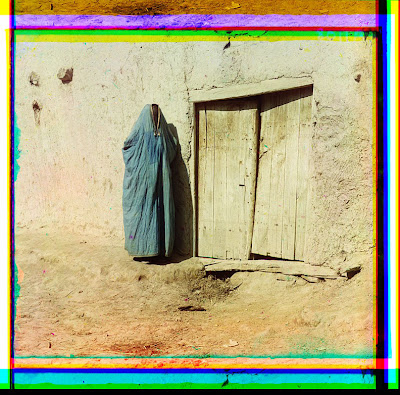
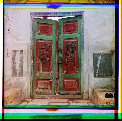
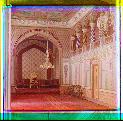
Samarkand
Bukhara
Bukhara.
(I see here some historical precedence for the Bukharan McMansions of Queens)
Armenian woman
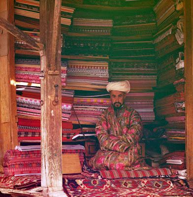
carpet seller (detail)
fruit seller (detail)
Bukhara
above two, typical natives of Dagestan
Sergey Mikhaylovich Prokudin-Gorsky (August 30 1863 – September 27, 1944), the photographer behind all of these images, was a Russian of noble extraction who studied chemistry under Mendeleev (creator of the periodic table). Moving to Berlin for more study, Gorsky applied his scientific background to photo chemical processing. He developed a pioneering method of creating color slide film and color motion pictures, and eventually garnered patents in Germany, England, France and Italy.
His process used a camera that took a series of three monochrome pictures in sequence, each through a different-colored filter. By projecting all three monochrome pictures using correctly colored light, it was possible to reconstruct the original color scene. (wikipedia)
Around 1905 Gorsky started devising a plan to systematically document the vast diversity of the Russian empire. Accomplished and well-connected, he was invited in 1909 to make a photographic demonstration for Tsar Nicholas and his family. The presentation went over so well that the ill-fated monarch gave Gorsky a specially equipped railroad-car darkroom, two skeleton key permits granting him access to restricted areas around the empire and cooperation from the far-flung bureaucracy. Suddenly, his herculean project became possible. Gorsky documented the Russian Empire from 1909 through 1915, and gave photo lectures thereafter. He eventually fled the country shortly after the Revolution, with the authorities confiscating about half his archive because of purportedly “sensitive material”.

After settling in Paris, Gorsky stored the remainder of his photographs and fragile glass plates in the basement of his apartment building. A few years after his death, in 1948, the US Library of Congress purchased the material from his heirs for $3500–$5000. Outside the Library of Congress collection, nothing else of Gorsky's work has yet been found.
Sergey Mikhaylovich Prokudin-Gorsky in 1912

LinkWithin

Related Posts Plugin for WordPress, Blogger...