9.26.2010

Beach Frolics, 1921

click for much larger images


Oh dear, first I got waylaid with work , then technical difficulties. Herewith a quick post of my latest purchase: a double-sided page of beach snapshots. One thing that never fails to send a shiver through me is the sight of all that wet and sandy wool knit on people. How was it possible that beach-goers slogged thru surf and sand in 90+ degree heat covered in dark leggings and tunics? Recently I was in a vintage store that had 2 pristine late 1920s tank suits: one men's, one women's. Both were charcoal gray and sweater weight. The distinguishing feature was that one had daring cut-outs on either side— that was the men's. I actually think some of the women's tunics, rolled knee socks and lace up bathing shoes are rather appealing— as autumn day wear...

A few men in these photographs are wearing tank suits that say "Ocean Tide Baths." With a little googling I find that this might have been out at Coney Island.
Evidently several bathhouses along the boardwalk with salt water pools, lockers, steam rooms, and even dance areas, were big teenage hangouts. I've found a few scattered reminiscences specifically of Ocean Tide, from the early 1950s.
Many times we went to Ocean Tide pool. I can still smell the steam bath my mom made me go into with her. The maze of grey wooden lockers we changed in. The steam room was a ritual we did at the end of the day before we went to the enclosed dance area with the wooden floor.

The Bay Ridge Lindy...was popular among the boys from Bay Ridge who danced at Ocean Tide. They’d swing their arm and then bring it up to the shoulder and that was basically the difference from the ordinary lindy that we knew!

I remember dancing at Ocean Tide….jukebox…6 plays for 25 cents!
Back with more substantive stuff next post.

9.15.2010

Edwin is getting careless

I read this New York Times piece about an incredible book project my friend Paul is in the midst of (that I did not know about) and I'm jealous. Briefly, Paul acquired over 300 report cards-cum-tracking documents dating from the 1910s through the 1930s from the Manhattan Trade School for Girls. Each dossier records physical measurements, family and ethnic facts, observational commentary, and has a small passport photo-like portrait. Each is a palimpsest of notations, crossings-out, updates and tantalizing glimpses of social and cultural history. Paul is deploying his obsessional researching capabilities and is attempting to track down the life paths indicated on these cards. How did the girls turn out? Where did they go? 

The cards are poignantly forward-looking (this girl has these promising traits, she can become X) yet at the same time the modern viewer looks back on them as fossil records of a long ago time. The journeys they portend are already finished—whatever the girls were to have become either came to fruition or not. And surely in virtually all cases, the "girls" are already dead.

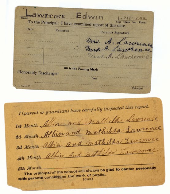
The article made me think of my own collection of report cards— all of one student—which I picked up at a flea market several years ago. My cards, far less interesting or informative, are the spotty school records, 1911—1921, for Edwin Lawrence. He attended P.S 164 and, later, Manual Training High School (now John Jay High School, just a few blocks from where I live) in Brooklyn. The cards are sad documentation of Edwin's slide from A's and B's in elementary school to his dismal showing in high school. Racking up 40's and 50's, failing hygiene, what on earth went wrong with this kid? His one shining moment appeared to be a strikingly incongruous 90 in music one semester. Perhaps if he had guidance, music might have led him out of his desultory adolescence.

9.09.2010

au courant, 1938

cover by AM Cassandre
Mies van der Rohe, noir style. The "famous German architect" was making his first visit to America. "He says that we should no longer be slaves to hour furniture and trappings: they must serve us."
"modern French decorating fabrics" painted by Cassandre
"black crepe cocktail dress, full skirted for the rhumba" shown with "gold and diamond cactus leaves" and fishnet stockings. The Surrealist hi-jinx in this photo was created by George Platt Lynes

"The amazing penthouse terrace of Carlos de Beistegui" sits atop his apartment built by Le Corbusier
"Lelong's rampage of color." Brown velvet skirt, red sash, green top and yellow bolero—with b/w images how am I to know if this is an abomination or an ingenious expansion of the boundaries of taste?
above and below, some fashion images with a surprisingly modern edge. Those crazy Steampunk goggles the gal has on are called "Deauville blinkers" in the copy
I've found myself in possession of a February 1938 issue of Harper's Bazaar (this was a special fabric and decoration issue of the magazine) for a project I'm working on, and its quite an eye-opener. I've posted a couple times on my preference for the days when fashion magazines used more drawing and painting (and less celebrity-mongering)—and this particular issue has a fluid mix of art and photography. That's a Cassandre cover at top and another painting of his illustrating featured decorator's fabrics. Many photographs by George Platt Lynes add to the Surrealist sensibility that makes its way into the magazine. 

I like the editorial tone: there's a madcap, determined joie de vivre about it. I cant help hearing Myrna Loy as I'm reading. There's an edition of the famous Diana Vreeland column "Why Don't You..." where she tosses off suggestions like having "Vertes of Paris paint you the gayest possible fire-screen." And a feature article on the Surrealism-inflected Beistegui residence in Paris coos about the "modern Fantastic" and "glorious hodgepodge" in rapturous prose. This, of course as the Depression dragged into its 9th or so year.

Random observations:
• It is interesting to see images that are noticeably "fashion-forward." For instance, I can see the 1940s from that "rhumba dress" above. Then, mixed in are plenty of advertisements and lesser fashion features that have a flowing silhouette lingering from earlier in the decade.
• Its disconcerting for the modern viewer to look at b/w images of fashion and have to read about the riot of color these outfits are recommending (see Lelong dress above). How do I know if this is an abomination or an ingenious expansion of the boundaries of taste?  That said, its even more impossible for the modern eye to interpret the stylistic merits and purchase-worthiness of shoes from a drawing.

8.30.2010

Vernacular signage roundup

four from the (my) archive. 
A few gems may be found at The Journal of Urban Typography

The makings of a beautiful book in the Walker Evans/William Christenberry/Stephen Shore tradition, on Flickr.
Vernacular Typography Polaroids by onpaperwings

Molly Woodward has a way with multiples and cropping.
Her images are gathered at the wonderful and thorough Vernacular Typography
Vernacular signs—local, site-specific, handmade or hand-crafted messages produced as a unique piece of art or a small run artifact, sometimes ethnically inflected, often naive. Many people, like me, are drawn to lettering and type in the abstract and all the more so when these are encountered in the environment. There's just so much fodder for the camera: hand lettered on board, hand painted on brick, carved into stonework, cast into metal, cut from plastic or shaped in neon. Some of the many reasons to take note of signs and lettering likely just outside your window: 
because they're painfully beautiful,
or laughably ugly,
or worn and almost forgotten, 
or goofily idiosyncratic,
or stunningly banal,
or regal and antique,
 or they're unintelligible—
because of how they look, yes, but also because of what they say, 
how they say it, and even where they say it.

8.24.2010

one more transmission from mission control

If something piques my interest I run with it: In my previous post about futuristic typefaces I wondered about the font "Countdown." How did that come to represent "computer" when I had never seen anything of the sort come out of or go into a computer. I spent way too long "researching" that by way of 1960s technology, old computer screens, punch cards, and printouts. Then I came across the above image of the Burroughs Datatron B220 control panel (c. 1963) and it made sense. Countdown seems as though it was based on the buttons and lights on a control panel, as in Mission Control, as in a countdown for a space launch...

This selection of computer brochures are brought to you by the Computer History Museum.


I must point out here that the promo copy on this 1965 cover says "Simultaneous multiple
access to more than 21 million bytes!" If I do my math correctly that means this 
big ol' hunk of tin had a memory capacity of 21MB— equivalent to about 15 or 
16 floppy disks.
Apollo mission control panels: dear God they sent men into space using Trimline telephones. One of many fascinating shots from the keen eye of Shaun O'Boyle.

8.23.2010

typefaces of our futures past

Yesterday I sent some rough sketches of a new design project I have to my friend Doug. It's a small book about a furniture/interior designer, and I was exploring a few different directions for the cover. I wanted a quick take on what I'd done. Well, Doug definitely told me what's what, which I begrudgingly appreciate. One comment was directed at this choice of title type:
Prisma by Svetoslav Simov
In as polite a way as email commentary can be he cautioned that the mockup, while interesting, might be stepping into Planet of the Apes territory. Harsh.
Now I know my titling looked nothing like that, but I understood what he meant: 1970s absurdo-futuristic. (Ironically, the Planet of the Apes logo was actually designed by a noted typographer, Ed Benguiat, but that didnt help me.)
Another typeface I was playing with was even goofier: Futura Black. I knew it had a pedigree coming out of the Bauhaus, and it was stencil-based, but it still had some kind of...science fiction taint to it. Sure enough, in looking into Futura Black a bit I found it on this obsessively documented site about the 1970s tv show Space: 1999. Seeing it in this context completely scared me off using the face in my project. I was, however, quite taken with Robert Ashley Ruiz and Roberto Baldessari who have compiled much much more than one might think possible about a fictional moonbase set 11 years ago in our former future. I do remember watching the show as a kid but what my 10 year old self couldn't have known was that the type used on the show was so considered.
artwork by Roberto Baldessari
Countdown, Colin Brignall, 1965. Designed for Esselte Letraset 
How is it that we see this and think "computer"? It represents nothing I've actually ever seen come out of a computer. In the 1960s punch cards were the method of programming, no? So what sort of computer produced text that looked like this? Is it just because I know this face is from the mid-60s that I envision the letters as life-sized props in a Courreges fashion spread? Colin Brignall designed numerous other distinctive and recognizable fonts, many of which bring you right back to Xanadu and the Solid Gold dancers. Brignall was awarded a medal by the Type Directors Club in 2000.
Data 70, Bob Newman, 1970. Designed for Esselte Letraset 
Another computer font that somehow seems more credible. Among Newman's oeuvre is the Frankfurter family, one of many fonts that seemed incredibly cheesy until all of a sudden it looked brilliant.


Futura Black, Paul Renner, 1929. Designed for Bauer Type Foundry. 
Another font choice of mine, tried in the furniture book I mentioned above. Although it went nowhere for this project, I'm really beginning to love this face. Interesting how something that started so rationally (from Bauhaus simplified geometry) turned so kooky. Futura Black has many moods depending on context: Jazz-Age, techy, designy, 70s kitsch. And then there's that almost-punny name.

Eurostile Bold Extended (also known as Microgramma), Allesandro Butti and Aldo Novarese, 1962. Designed for the Nebiolo Foundry
A quietly "futuristic" face that makes me think of luxury goods. Eurostile was featured on HAL in 2001: A Space Odyssey.
This is one rambling post but all this makes me wonder: What makes a type seem futuristic? In the 20s through the 50s it seemed to be little more than an oblique slant and possibly some zig-zags, fins, or electric "rays." The original Star Trek logo (c1966), above, is quite "old fashioned" for its time (compare Countdown, above from a year earlier) evinces more than a little "Flash Gordon" deco styling. So much more can be said on this...

LinkWithin

Related Posts Plugin for WordPress, Blogger...