Showing posts with label momentary obsessions. Show all posts

12.17.2013

Pill Heds


I've been thinking about drugs names. I don't think I'm alone in my occasional scrutiny of these mysterious, often ridiculous, sometimes brilliant confabulations. (The pharmaceutical business spends a good chunk of their budget on branding and naming and I think this tangential element of design justifies my assessing the results, no? I'm not going into the logo design here, but see this amusing step by step "review" of Ablixa.)

Huge potential money-makers like psychopharmacological agents and erectile dysfunction buttresses have particularly high stakes in naming and design. According to Medscape the cost in 2001 of consultation on naming alone ranged from $100,000 to $700,000. Elsewhere I read the numbers are "easily" $500,000 up to a couple million.

Each drug receives 3 names:
• the chemical name—usually a string of prefixes, numbers and a lot of "ethyls" and "phenyls"
• the International Nonproprietary Name (INN, also known as the generic name)— these names are created from a standardized group of "stem" components which represent different classes of drugs (eg. anti-inflammatories, antidepressants)
• the brand name

here's an example:
  • chemical name 7-chloro-1,3-dihydro-1 methyl-5-phenyl-2H-1,4-benzodiazepin-2-one
  • generic name diazepam (-azepam is used for many antianxiety agents)
  • brand name Valium
Names have to be memorable, convey something medicinal and curative, not interfere with international marketing (ie. should not sound like "bad luck" in Chinese) and not be too similar to something already out there. This last criterion is not only for marketing purposes— the FDA evidently rejects 4 out of 10 names so as to not create confusion and possible medical disasters (for instance Celexa vs Celebrex).

Going through what must surely be a gauntlet of committee presentations and focus-grouping, how on earth do names like Xalkori and Xofigo see the light of day? The New York Times noted that "drug makers have favorite letters, and they run the gamut from X to Z." They quoted James Dettore of Brand Institute and explained;
"the letters X, Z, C and D, according to ...  "phonologics," subliminally indicate that a drug is powerful. "The harder the tonality of the name, the more efficacious the product in the mind of the physician and the end user," he said." 
 According to Slate, though, there might just be a computer algorithm behind all those Xs:
During tough financial times... many drug manufacturers skip human consultants and use computerized algorithmic name generators because they just want something that will get quick approval from the FDA and don’t care how ridiculous the name looks or sounds. //
My not-so-empirical approach to looking at drug names
the word-- how does it sound? how does it look?, associative images–– what does it sound like? what does it bring to mind?, appropriateness–— how well does the name work for what the drug does?

Successes:
Ambien—pretty good at conveying a zoned-out calm, perhaps a little too techno
Zoloft—  its propping you up, get it?--holding you zoloft
Viagra— brilliant— it's vigorous, it's vital, it's Niagra Falls for chrissakes
Abilify— "this antidepressant has abilified me to be functional!"
Keppra— Strangely elegant and aloof, like the name of an ancient Egyptian deity. Not bad for an anti convulsant

The not-so-greats:
Vioxx— a vanquished Transformers villain— anti-inflammatory now off the market
Viibryd—looking like something you'd find at IKEA (thanks Andrew) this antidepressant doesn't even have an aspirational quality. plus the sound of it seems a bit too manic for a mood stabilizer
Coumadin—a blood thinner that sounds like a mid-level bureaucratic title of the Ottoman Empire; its generic name, warfarin, sounds like a strategic conflict board game
Effexor— this antidepressant reminds me of Gigantor, Space Age Robot
Aubagio— sounds to me like an Italian restaurant you'd find on Staten Island, odd association for drug to treat multiple sclerosis
Stalevo— treats Parkinsons disease but looks like it's a city in Serbia
Simponi Aria— is it part of an Italian opera? an obscure part of the brain (see Wernicke’s area)? No it treats rheumatoid arthritis. Perhaps it leaves you singing.

Fails:
Fungizone— targets potentially fatal fungal infections; the name sounds appropriate in a blatant ham-fisted way, but I would not like to tell people I was on it.
Latuda—an antidepressant that seems more like a vulnerable area of the lower back; see  "phonologics"mentioned above—this drug doesn't sound man enough to make me happy
Lamictal— looks like a term for a pus-forming condition—not so good for a mood stabilizer/anti convulsant
Zortress—suppresses the immune system but sounds like a 1980s video game
Zingo— just completely wrong


11.09.2013

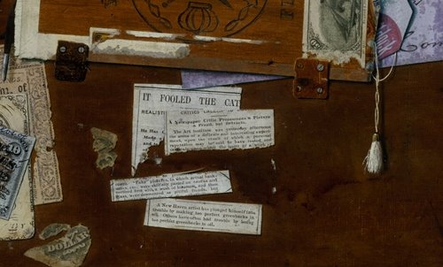
It Fooled the Cat


Artist unknown
Rack Picture for Dr. Nones, 1879 

Art Institute of Chicago

William Michael Harnett [1848-1892]
The Letter Rack
The Faithful Colt
John Haberle [1856-1933]
A Bachelor's Drawer (and 2 details)
The Slate


I recently did an invitation for the New-York Historical Society for an upcoming lecture called “Trompe L'oeil and Modernity” (see top image here, used on the invite). I'd link to the information but it is already sold out! (but I'm going!) My encore updated post here is very on point:

The book The Arts of Deception: Playing with Fraud in the Age of Barnum by James W. Cook examines the curious strain in 19th century popular culture of illusionism (the self conscious aesthetic and cultural mode that "exists on the boundary between fact and fiction") and artful deception (which employs illusionism but purports to be real). Illusionism pervaded a range of 19th century entertainment, from Barnum's "humbugs," like the Feejee Mermaid, to Paul Phillipoteaux's Gettysburg Cyclorama, through all sorts of magic lantern displays, wax figures and sleights-of-hand. I imagine Cook could include the rage for seances, mediums and spirit images as well, though he doesn't go into these. In Cook's view, the public's passion for deceptive spectacle was influenced by the new "discourse" of advertising, social hierarchies and the expansion of the middle class, and the scientific inquiries of the time. Why was it though, that in a time of exacting definitions of propriety, when morality was strictly parsed and appearances were de facto comments on pedigree, society was thrilled by the questionable, and the ambiguous?

I was particularly interested in his chapter on trompe l'oeil painting--a genre which relied on spectacle. Numerous notices of the time described audiences that gathered to argue, gape at and dispute the nature of the paintings. Many of these paintings were run-away pop-cultural hits. Art critics of any standing, though, customarily dismissed trompe l'oeil work, likening it to the "curiosities" that garnered crowds at dime museums– vulgar and without merit. The work was easily employed in aesthetic and social judgments: if you like this stuff you are a philistine or a rube.

Harnett, Haberle, and Peto --three of the most successful trompe l'oeil painters–often used commercial packaging and other ephemera in their work (like the Dadaists would do literally 20-40 years later). But they were consummate nostalgia-peddlars (a pretty new idea at the time, the sentimental as cottage industry) who incorporated emblems of the West and cowboy life, Civil war paraphernalia, souvenir images of Lincoln, even recalling the good old days beside Grandma's Hearthstone. (Note that Haberle includes a "newsclipping" in his work The Bachelor's Drawer which purports to recount how Grandma's Hearthstone—his earlier painting!— was so convincing a cat curled up beside it's "fireplace"). These visual panoplies of the stuff of everyday life and the traditional home played to growing anxieties in contemporary 19th century society that modernity was erasing a way of life.

The heyday of trompe l'oeil was essentially contemporaneous with Impressionism, and a bit after. Most people think of latter as the aesthetic break-- edgy and avant garde while the former was populist and easily digested. An idea that intrigued me in the book was that trompe l'oeil, while not leading to Modernism, was never-the-less part of a changing visual mode. These sorts of perceptual 'experiments' lead to visual education and redefined the viewer as subjective participant. Visual doubt, essentially, (exemplified in these popular works) was part of the lead up to modernity.

Also worth noting is the fact that yesterday's avant garde (Impressionism) is today's greeting card art, while the overlooked populist work is the stuff of art historical criticism. 

See also "I'd like to thank the Academy..." my post on Academic art and silent film.

8.06.2013

Recognized in Passing, Part II

Mott Street at Canal, c 1905
Mott Street at Canal, 2013
c.1940
Not my most elegant post, perhaps, but it makes up with raw enthusiasm what it lacks in style. I happened to be down in Chinatown, crossing Mott street where it meets the Bowery, and stopped in my tracks. I recognized the view. I knew I had stashed away a vintage image (by way of Shorpy, "the 100 year old photo blog.") of a funeral processing down that very stretch of street, c. 1905. Once you study it, you realize quite a few of the buildings remain, they're just encrusted with a visual blight of signs, altered by bad storefronts and obscured by a welter of street furniture. And of course the cars.

In the first 2 photos, the building at far left with arched windows even retains the shutters and the very same fire escape. Further on (second from bottom photo comparison) you'll see the 2 tenements with ornate cornices as well as their plainer neighbors and the church remain. The Church steeple has lost its ring of tiny dormer clerestory windows on the slanted roof but its otherwise unchanged.

Most puzzling is the fate of the building mid-block on the left, identified in the vintage shot as #5, the Imperial Restaurant. It has beautiful ornate iron grillework on the second story balcony and is hung with paper lanterns. On street level is a pagoda-style entry. It's a 6 story building. Today the stunted yellow structure at number 5 stands only 4 stories tall. Oddly, it too is a restaurant ("Buddha Bodai Nature Kosher Vegetarian Restaurant") and has a second floor balcony, but for no apparent reason. Could it be a remnant of the former building left during remodelling—rather than a new building? Nothing about 5 Mott Street seems particularly logical or planned (a blocked up 4th floor for instance) which led me to think it might be the original building, with an expedient, rather than sensitive, overhaul. A quick look on Emporis lists the construction date as 1910. Although thats notoriously unreliable it does indicate the building is "old." Further research finds the building was described as "new" in 1903. The image, bottom, from the Museum of the City of NY shows the building, full height, in 1940.

Check out my previous Recognized in Passing with Elizabeth Street.

4.12.2013

38+ shades of grey

Iceland greys
19th century Dufour et Cie Psyche grisaille wallpaper panel. the paper trail
Farrow and Ball paint chips
undyed wool
Claremont Grisaille, fabric by Schumacher
Confederate greys
my mother and her pet chicken, 1930s
above and below, Vija Celmins, Ocean, 1975 and Explosion at Sea, 1966
ash, carbon, cinder, lead, smoke, fog, battleship, greige, Davy’s, charcoal, heather, flint, cement, slate, silver, platinum, titanium, warm, cool, dark, light, medium, pigeon, elephant, graphite, pearl, dove, glaucous, Cadet, cinereous, mouse, gunpowder, stone, fuscous, liard, lavender, blue, steel, mercury, chinchilla, seal

I've been thinking about grey. A design job I was working on turned unexpectedly difficult this past week when the printing of some 4-color greys proved to be a stubborn wrangle. [In printing, as you may know, all colors are reproduced as flat (or Pantone) inks or represented by overlapping tint screens of cyan, magenta, yellow and black ink ("4-color" or "CMYK")]. Grey, I have confirmed firsthand, can be difficult to capture in 4-color printing. The tone can shift to purple, green, or a brown muddiness; ironically there is a lot of color buried in grey.
Despite an array of odd, unlovely and opposing connotations, I've always loved grey. It has an elegant subtlety, range, and depth: Grey matter, grey flannel, Grey Lady, eminence grise, strength, intelligence, sophistication, business, storminess, boredom, depression, old age, grey area, doubt, indistinct, equivocal, dustiness, dirt, disuse, poverty, humility, religious asceticism, modesty, conformity, totalitarianism, secrecy, shadows, fog...  Grey is protean; it's never black or white.

4.03.2013

Top Form


White silk, or probably beaver, hat, c 1848, from iphotocentral 
Below, how did the top hat sink so low?

Lincoln in his stovepipe at Antietam, 1862
Mose, famous Bowery B'hoy and fireman, was a New York urban hero character popular for decades.
Mose's and Bill the Butcher's hats should probably have had more in common, but the subtleties may have been more than the costume designer was able to discern.
"Bill the Butcher", Gangs of New York
His hat probably would have been glossy black with a flat brim, similar to Mose
Civil engineer Isambard Kingdom Brunel, and below, second from right, at the attempted launch of the steamship Great Eastern, November 1857, via His hat seems a little worse for the wear
Ambrotype of two would-be dandies, c.1855. via FIDM
A conformateur, a hat-fitting device. See much more at the Musee du Chapeau in Bern
The Brighton Swimming and Sea Bathing Club, 1863, via
"Modifications of the Beaver Hat"
Henry IV of France, 1591-- Top hat progenitor?
Above and below, two Incroyables— young French aristos who mixed reactionary politics with outré fashion
after the Revolution. They're both cutting very daring figures for 1798 by wearing the "Titus" haircut—
we know it as a Caesar—and abbreviated top hats.
This is when the top hat really got going.

The man above is also carrying a noteworthy accoutrement— the umbrella.
The Mad Hatter by Sir John Tenniel, 1865/1871, and Uncle Sam by Montgomery Flagg, 1916/17: both wear white or dove beaver toppers in the flared, modified "Wellington" shapes. Uncle Sam would have appeared pretty retro in 1916
Ladies in riding habits, c 1900
Astaire, making a last hurrah for top hats in the eponymous movie, 1935
Top hat, beaver hat, high hat, silk hat, chimney pot hat or stovepipe hat: all names for the tall, flat-crowned, broad-brimmed hat, primarily recognized in the United States as a receptacle from which to extract rabbits and for being Abraham Lincoln’s headgear of choice. A bit of history:

Something that appears similar to a top hat crops up sometime in the very late 16th century. During the 17th century vaguely top hat-like appurtenances called capotains could be found atop Puritans (think "Pilgrim Hat" ) and English Civil War antagonists. I don't really count these.

The style really picks up after the French Revolution when those who kept their heads
dared to throw off the powdered wigs and adopt outlandish head gear. (See those crazy Incroyables and Merveilleuses.)

Top hats made from felted beaver fur dominated the 19th century (the industry practically wiped out the beaver). I've always loved the exaggeratedly tall Lincolnian version but the subtleties of this type of hat are myriad. It took on dramatic cylindrical, flared or pegged crowns (rising to over 8 inches in the 1850s); brims could be wide and flat disks, or rolled and swooping. There were even collapsible "Gibus" variants made so everyone could attend the opera without coming to blows.

The top hat steamed its way into the 20th century (by now made of glossy silk plush) and made it through the 1930s retaining most of its dignity. By Kennedy’s 1961 inauguration it was an awkward throwback. And alas, as the 21st century dawned, this once crisp and debonair hat was relegated to Halloween costumes, a few cloying rock guitarists, and legions of Steam Punk aficionados and Comic Con attendees.

2.04.2013

Dismal Days


Images from Liber Chronicarum, or Book of Chronicles, better known as the Nuremberg Chronicle, printed in both Latin and German in 1493. It is one of the first early printed books to successfully integrate illustration and text and is the best "preserved": approximately 400 Latin and 300 German copies survive. 645 discrete woodcuts were created for the book. Albrecht Durer was an apprentice to the artisans at the time. See incredible scans of an entire colored copy from the Munich Digitization Center (MDZ)/ Bavarian State Library.

Throughout the Middle Ages— and up til the 19th century-- it was commonly thought that certain days of the year were unlucky. Popularly known as Dismal or Egyptian Days these were times one was to avoid undertaking important activities such as travel or marrying, and were ill omens for health as well (if you got sick on one of these days you'd not be likely to recover). These were quite different from calendar days considered pivotal, inauspicious or notable for reasons to do with agricultural stages, astronomical alignments or lunar phases. Those had self-evident reasons for being (whether or not they were based on correct fact is another matter). Unlucky days were unlucky-- but they were traditionally so, no one actually knew why.

I first came across the term Egyptian days in Religion and the Decline of Magic by Keith Thomas, a brilliant, sprawling study of magic and the medieval church*. Analyzing how magic and supernatural folk traditions existed side by side with religion, with the church often mirroring aspects of folkways (miracles? bell-ringing? relics? check, check, and check), the book shows how magic even survived the Reformation, adapting its form and intermingling with scientific inquiry. Both fascinating and not easily described Religion and Decline deserves a separate post.

Etymologically, dismal means “bad day,” coming, via Anglo-Norman or Old French dis mal, from Latin dies mali. The phrase literally means “evil days” and it's documented that the Romans recognized these as dies nefastus. There is speculation that the Romans thought the days to have been computed by Egyptian astrologers, and were possibly related to the Egyptian plagues. Dies nefastus were therefore also referred to as Egyptian days or dies Aegyptiaci. (Because Egypt = cryptic, occult, and ancient even to the ancient Romans). By the fifteenth century dismal, having been “unlucky”, came to mean “gloomy” or “miserable”  and eventually “depressing to the spirit, or showing a lack or failure of hope.”

The list of days seems to have varied according to which source you happened to check since they were sometimes not recorded as dates but rather as "the last Monday in April, the second Monday of August, and the third Monday of December" etc. Different days had different degrees of bad luck; some were equivocal, others totally disastrous. Here's a list I've come across, and today is a Dismal Day:  
January 1 and 25
February 4 and 26
March 1 and 28
April 10 and 20
May 3 and 25
June 10 and 16
July 13 and 22
August 1 and 30
September 3 and 21
October 3 and 22
November 5 and 28
December 7 and 22


*This drily humorous and peculiar book also introduced me to "planet-struck" (similar to "moonstruck" it means adversely affected mentally or physically by the planets and was sometimes listed as a cause of death), "cunning folk" (wizards, soothsayers and healers) and "elf-shot" (bedeviled by elves, gremlins and other spirits).

LinkWithin

Related Posts Plugin for WordPress, Blogger...