skip to main |
skip to sidebar
From the collections of Ephemera and Advertising.
School of design, 1859; Phrenology chart; sheet music, 1880, 1863, 1873, c.1880s; "Soft Ones a Specialty", 1907; from the pamphlet "8 United Mastodon Shows by Maybury, Pullman & Hamilton", 1882.


 I recently retrieved all three of my Amphigoreys from storage and in poring over them page by page, I have been struck once again by his hand-lettering. Here, a selection of his titles and lettering (Romans, tuscans, rustics!). Directly above are three of his book jackets from the 1950s from a good selection found here. All the text is obsessively– ingeniously– hand-lettered. (I had never been quite sure and used to study and compare "s"s or "n"s.)
I got the first Amphigorey collection when I was about 10 years old and it made such an impression– I loved it so much– I didn't know what to do with myself. Has anyone else ever had this? When there is something that leaves you so awe-struck, so full of wonder– something that feels so perfect in every respect, so exactly what you, yourself, would want to do if only you could–that you want to live in it, be it. I was wholly enveloped by the flamboyant peculiarity, the play of image and word, the morbid density (see horror vacui) followed by a radical graphic spareness. And of course there was Gorey's consummate parceling of story, line by line, epigrammatic, often non sequitur, that was particularly appealing to me. Much later I learned that Gorey modeled his visual style, somewhat, on 19th century engravings (though his characters appear to drift perpetually in a 30 year time period roughly between 1890s high Victorian through Edwardian and occasionally showing up in Flapper regalia). His prose style somehow conflated the portentous air of 19th century schoolbooks and comically bleak children's religious instruction primers with a sly voluptuary's wit.
I find myself still not quite sure how to process my emotional mix of envy and worship.


 I was not aware of Carlo Bugatti when I saw (a version of) this desk (top) at the Art+Design Show at the Armory this past Thursday. The name was vaguely familiar–race cars wasn't it?* or motorcycles? But not furniture. Certainly not this slightly disturbing crenellated fantasy in walnut, copper, vellum, and mother of pearl. Why disturbing? because it was almost animalistic. And I couldn't place it– definitely Arts and Crafts-ish, sort of Eastlakean, but as though interpreted by an alien. Japanese? Indian Raj? Moorish? Arab? Yes!
Bugatti was born in Milan in 1856. He studied at the Brera Academy of Fine Arts and began making furniture in the 1880s. The earlier furniture's rectilinear asymmetry and exotic materials--encrusted and embellished--recalled the Orientalism of the time; the later sinuous forms were influenced by Art Nouveau. But the aggressively hybrid vision was truly, singularly his. Gaudi is the only other designer of the time I can think of who was as profoundly bizarre.
Bugatti gained international attention at the Exposition of Decorative Arts in Turin in 1902 with his "Snail Room." The tantalizing but maddeningly indistinct photo directly above is all I could find of the exhibit. His "Cobra chairs" (above the Snail image, right), created for the Turin exhibit, are entirely covered in vellum-- as was much of his later furniture. At some point his furniture also graced the Waldorf Astoria’s Turkish Salon, where, it is said, coffee was served by an actual Turk complete with a boy attendant...
Extravagant, daring, bewildering, excessive and fascinating, Bugatti's work was renowned for meticulous craftsmanship and eccentricity but was never truly popular. Perhaps because, as the Cleveland Museum of Art notes, it was extremely "challenging."
His design star was occluded by the time he died, in relative obscurity, in 1940.
*His son Ettore went on to found the automobile company.
----
Bugatti's designs are like ceremonial furnishings for some alien royal court. Something about the spikey "tribal" regalia draping many of Bugatti's pieces reminds me of Frank Frazetta.

Corposant-- the ball of fire which is sometimes seen playing around the masts of ships in a storm, from Italian corpo santo-- holy body. St. Elmo's Fire.
Dying Sayings --... Archimedes to the Roman soldier: "Wait til I've finished my problem." ... Voltaire : "Do let me die in peace." ...
Tartarus-- infernal regions of classical mythology, used as the equivalent of Hades but Homer places Tartarus as far beneath Hades as Hades is beneath the Earth
Dr. Ebenezer Cobham Brewer described his Dictionary of Phrase and Fable as "a treasury of literary bric-a-brac." I think of it as a rollicking pageant of erudition, flinging out tidbits of wisdom and rightly forgotten obscuranta alike, from "the Aeolian mode" and "baton sinister" to "whipping boy" and "zingari." I found my pitifully dog-eared copy of the 1981 edition at the library sale on Shelter Island and pedant and avid pursuer of trivia that I am, I use it as bedtime reading. And it's great fun.
A bit of background: Brewer graduated from Trinity College, Cambridge, in 1836 and was ordained two years later. Ultimately a failed academic, he proceeded to fill his days compiling dictionaries and surveys, and regimenting a popular children's education series with astonishing speed. He wrote or edited such weighty tomes as An Entire New System of Book-keeping (1853), A Guide to Roman History (1853), Sound and Its Phenomena (1854) and Dr. Brewer's Guide to Science to which is added Poisons and Accidents, their antidotes and remedies (1859) among many, many others.
"What a fussy old gentleman Dr. Brewer is," complained an editorial colleague, although Brewer was just 54 at the time. "He is so insufferably inquisitive and such a gossip!" Dr. Brewer's grandson, in a late memoir, depicted him as far more genial and entertaining, but loony never the less: "The walls of his room were papered in a plain white paper upon which he used to write in pencil stray memoranda and the names of an particularly interesting visitors...."
Grammarian, Classicist, scientific dabbler–Brewer belonged to an era of moral uplift and self-betterment. And it was in that grand spirit of inquiry that Brewer catalogued folkways, classical references, linguistic anomalies, Latin phrases, and popular trifles and issued his Dictionary, in 1870, for his countrymen's, and posterity's, edification. Although his publishers remarked tartly that they were "doubtful whether the book would pay the expense of printing" the Dictionary recently enjoyed a 17th edition just last year...
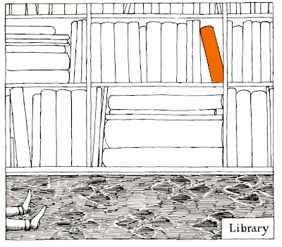
image from Amphigorey Also, Edward Gorey.


 Here, some fantastical illustrations from The Book of Life: The Spiritual and Physical Constitution of Man by Dr. Alesha Sivartha. Sivartha was the assumed name of one Arthur Merton, MD (1834-1915), purported to be the illegitimate son of Raja Ram Mohun Roy Bahadoor, an Indian scholar, activist and Brahmin, and an unknown English Unitarian woman who dallied with the Raja on his tour of England. Merton began his quasi-scientific Biblico-Evolutionist parsing in 1859, evidently self-publishing several volumes. His son published a thorough updated tome in 1912. From what I can see the pages are filled with a hybrid of spiritual intensity, Hegelian determinism, economic dabblings and obsessive hand lettering. Let the good doctor speak for himself:
science and history both answer that man has advanced step by step from the ignorant and selfish rule of his lower brain organs up toward the beneficent dominion of his higher brain faculties. The laws that have controlled that vast upward movement are still in force...And they are of supreme importance for they determine what new institutions and what social changes are now required to meet that higher growth of nations.
The many many illustrations are what set my pulse racing of course: part phrenological, a lot outsider art. The hand-drawn type is particularly masterful. I was enveloped by the density and the obsessional zeal in the same way I was with the drawings of Adolf Wolfli whose mad genius I discovered at the Folk Art Museum a few years ago.
Charts, diagrams and hierarchies of obscure or dubious content are also a fascination of mine...
I found the good doctor by way of No Relevance on a random late night net ramble (more on late nights in a coming post). The Book of Life site is sensitively written and minutely presented by Sivartha's great great grandson, who unfortunately lost a bit of my scholarly confidence when he recounts how he "did meth and fried my brain."


 Another in an occasional series that casts a spotlight on a few of the best blogs I frequent.
Here, the art of memory by one, Matthew Swiezynski. Alighting on cinema but hovering closely over art, photography, and music, as well, the blog is truly about a sensibility. A beautiful and hushed moodiness. I can go there and revel my own interests (Netherlandish painting, film noir, Hopper) but come away with glimpses --microscopically intense or broad and hazily evocative--of things I would not have otherwise known to explore: experimental drone music, obscure (and not so obscure) cinema... Observations, lists, examples and associations-- random parts that do, in fact, make a whole.
images: film still, photos of Venice by Matthew Swiezynski

 "We're trying to run a city, not a goddam democracy!"
This weekend I saw "The Taking of Pelham 123," the classic heist movie from 1974. With Walter Matthau, Jerry Stiller, and a mesmerizing Robert Shaw, among others, and a brash, driving and consummately 1970s musical score by David Shire (nothing says 70s like a big honkin' horn section) it was much better than I had vaguely recalled from tv viewing. The real fascination for me, though, was the window onto a vanished New York.
I'd been thinking about New York City in its "heyday"--when the city itself was a character on film, not just the backdrop. From lovable ramshackle mess --all crumbling infrastructure and idiosyncratic "Only in New York!" punchlines to dystopian nightmare. In a recent post I talked about New York before anyone thought to Y it--when it was "Fun City": fiscal crises, transit strikes and blackouts.** In the movie's original review, published October 1974 in the New York Times, Nora Sayre, made the keen observation that: "Throughout, there's a skillful balance between the vulnerability of New Yorkers and the drastic, provocative sense of comedy that thrives all over our sidewalks." Fatalistic resignation and a dose of exasperated humor in the face of menace was every New Yorker's stance-- at least on film.
The movie was a study in obsolete apparatus: money counting machines, bulky intercoms, lightbulbs flashing on oversized analog display panels, and comically large and noisy buttons. Everyone spoke in a strikingly antiquated dialect that didn't seem possible that late in time--more Jimmy Cagney than Jimmy Breslin-- '"noive" center,' "For Pete's sake," "lousy," "dame"... (but I suppose Archie Bunker was still switching his "oi"s and his "er"s --"terlet" or little "goil"--on prime time well into the 70s).
---
* Walther Matthau as MTA chief Zachary Garber: "In the course of a normal week, the average TA policeman deals with such crimes as robbery, assault, murder, drunkenness, illness, vandalism, mishegaas, abusiveness, sexual molestation, exhibitionism..." Addendum for those non-New Yorkers who may be reading: mishegaas is Yiddish meaning "craziness, tomfoolery." Yiddish was one of the big contributors-- in vocabulary and intonation-- to the distinctive "New Yawk" accent.
**What would a New York City-Fun City film festival include? Death Wish, Escape from NY, The Out of Towners? Someone with a better knowledge of cinema could do wonders...
---
I'm not sure what accounts for the three different poster approaches above but I like the first one with its grainy high-contrast black and bilious yellow. Setting everything on the diagonal, with the subway car careening out of the frame, is brilliant.
---


 Tintypes, also know as ferrotypes, were the snapshots of their day. With an amazingly long run in popularity, they were inexpensive, widely available and relatively "instantaneous" (exposures were probably seconds long rather than minutes) alternatives to the more rarefied daguerreotype. Beginning in 1856 or so they brought photographic portraiture to the middle and lower classes, soared in popularity during the Civil War and eventually found a permanent place at fairs, resorts, and carnivals well into the 20th century.
The daguerreotype was a single, very fragile (and costly) confection of glass, buffed copper and silver--the image produced was shimmering, luminous and mesmerizingly detailed. But what the stolid tintype (which was exposed onto a plate of iron, hence the ferr of ferrotype, not tin) lacked in refinement it more than made up for in its availability, and was often produced in multiples. The tintype allowed soldiers, sweethearts, friends, tourists, babies, couples, and even pets their moment in the spotlight.
Images from top: detail and full image of a young woman c. 1870s; a Gem tintype (approx 1.5" x 2") in handmade and decorated frame, inscription says, "Carrie Sherman 12 years old Feb 11 1896-- this picture taken March 28 1896"; mysterious woman in printed paper frame, tinted cheeks and ribbon, c late 1860s; floppy baby c 1870s; young couple c late 1860s--the woman is almost smiling which is quite rare.


 A small selection of Dutch and early Flemish portraits. Early on these sitters were often donors painted into the religious scenes they financed, in later images they might be prominent burghers paying for a formal portrait, the artists themselves, or bit players in a genre scene. They were nearly always rendered with details indicating status, piety, marriage status... I love the frankness, the improbable sense of intimacy (across centuries!) and quiet melancholy. From top: Jan Van Eyck, Gerrit Dou, Quentin Massys, Van Eyck self portrait, Franz Hals, and Petrus Christus' magnificent Portrait of a Carthusian which I discovered on my Museum Day several posts ago.
Below the portraits are images from a series called "The Regulars" by Sarah Stolfa, an MFA candidate in Photography at Yale. She shot them during her time (a couple years?) bartending at McGlinchey's, a tavern in Philadelphia. I discovered her work in a beautifully written review by Carlo Rotella in my alumni magazine:
There's a resonant lonely distance in these portraits, and mystery, but none of the anonymous noir romance of Edward Hopper's nighthawks... [they are] intimate but restrained-- rich but not overripe, realistic but not entirely natural.
I happened to read that the 15th century contemporary word for portrait was conterfeytsel-- the modern English equivalent being "counterfeit." Implying both extreme fidelity as well as falsity, it highlights the deceptive sense that the viewer can "know" anything about these sitters. A collection of props and shadows. This image doesn't quite fit in with this series but in doing picture research for this post I was reminded of how much I'm drawn to this painting. It is thought to be a self-portrait by Michael Sweerts, around 1650s I believe. He seems to have been a troubled soul, dying from some sort of mania after having followed some Jesuit missionaries to Goa.
His dreamy melancholy, unguarded expression, and the ease with which he rests his head on his hand is, to me, startlingly appealing...


 Truly Exceptional! Without Peer!


 Posts
Posts


