6.27.2009

Hollandaise source


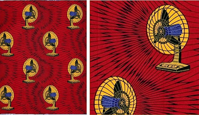
(the pattern above, is called Holy Ghost Fire)


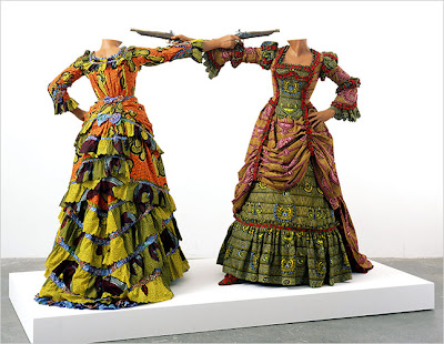
At top, Yinka Shonibare How to Blow up two heads at once, 2006, incorporating Vlisco Dutch Wax fabric
Shonibare's work deals with post-colonial cultural amlgamations and cultural authenticity


All other images, Vlisco


I was vaguely familiar with what I thought of, generically, as African print cloth: bright–often harsh– color choices, large patterns. That was about the sum of my knowledge. I nearly gasped when I found out about Vlisco, the Dutch fabric company that produces* much of this wax print "African cloth." In Ghana, Ivory Coast and other West African countries, "Veritable Wax Hollandaise Vlisco" (Real Dutch Wax, Vlisco) carries the same cachet as Rolex or Louis Vuitton. Popular with the "Nana-Benzes," (ladies who favor their Mercedes) Vlisco evidently pairs well with their gold-framed eyeglasses, necklaces, and gold wristwatches.

How did a company in a small town in Holland become the major purveyor of quinessentially "African fabrics"? By way of Indonesia. Dutch traders discovered Indonesian dyed fabrics and imported them back to Europe. The van Vlissingens, a Dutch merchant family, had the idea that batik dying could be mass-produced in Europe and Vlisco was established on August 15, 1846. By the late nineteenth century Dutch factories were supplying the bulk of the Indonesian batik market, and as Dutch freighters stopped at various African ports on their way over, the fabrics began to gain an African clientele. West African soldiers serving in the East Indies also took to the fabrics and brought them back when they returned home. At the beginning of the twentieth century, when economic restrictions were enacted to protect domestic Indonesian batik production, Africa gradually became the exclusive market for Dutch batik. Central and West Africa in particular embraced the fabrics, integrating them into the local culture.


Do-lo-rez ottomans upholstered in Vlisco by Ron Arad for Moroso
photo from yatzer

The prints are vivid, overscaled and exhilarating.
Many of the fabrics, though, feature incongruously representational—realistic—subject matter. It is this literalness that I find difficult to... parse. Vlisco has been showing up in Western fashion
and now industrial and interior designers are incorporating it as well (see above). The fabric's use in nontraditional ways has a brio and irony that is ravishing. But with the wax print fabric's original colonial provenance in mind, out-sized patterns of table fans, video game control panels, wristwatches and richly outfitted kitchens veer uncomfortably close to 'naive' and 'totemic' for me. A kind of conflation of animist wish fulfillment and western status good. Rather than wearing the logo, wear (the representation of) the object itself— or a list of your favorite possessions.

Some background from the exhibit
Fabric of a Nation: textiles and identity in modern Ghana held at the British Museum in 2007:
Wax prints are prestigious cloths with a high social value... Cloths are also widely used as a powerful mass communication media, for commemorative, political, religious, social and other message conveying purposes.
Similarly a Vlisco press blurb offers this quasi mystical take on, essentially, wearable inventories of material goods:
This collection is a symbolic interpretation of crowning moments and treasured possessions. The designs reflect abstract objects and images that bring memories to life in vivid, fantastical form. Each fabric tells a colourful story of its own, personal to those who wear them and those who admire them. How looking through a key hole or ringing a door bell or taking a journey may have changed your destiny. How precious items or music may speak volumes to you alone. Each design evokes a personal, unique connection and bond. So, reflect upon your own journey.
Surreal. Equal parts "shocking" Schiaparelli gesture, superstition, and status trade trinket...

* Some explanation of the process: Wax print fabrics are created with a resist-dye technique akin to Indonesian batik. Engraved copper rollers spread hot wax on both sides of a roll of fabric. The cloth is then dipped into a dye bath, color penetrating into the areas that are not covered with wax. (The sign of a quality wax print is that the cloth is printed on both sides.) The wax is washed off in varying stages and the process is repeated, layering the color prints. The technical difficulty in trying to align patterns in different colors gives the lesser quality productions a slightly haphazard organic quality. Colors that don't align properly come out looking like bad offset printing, which I find enormously appealing...

Addendum: interesting information and observations from someone familiar with some of the traditional fabrics in Africa (Thank you, Nina):

When we lived in Cameroon I collected a lot of cloth materials (called "pagnes" which is french for loincloth) but unfortunately the Chinese have now entered the market and are doing it much cheaper than anyone else. Subsequently people are buying it from them rather than the Dutch and the quality is entirely different. Also, because of the immense volume of used western clothing being shipped to Africa it is so much cheaper for people to buy western clothing instead of having things made out of the traditional cloth. That is also a reason for the decline. Here in Madagascar, except on the coasts, no one wears the traditional lamba material either. In the markets you can buy t-shirts, pants, shirts, etc. for pennies. It is a great pity. I miss a lot the color and mix of design from Central and West Africa. Something else that was also fun to see were the cloths printed for every occasion by businesses. The beer manufacturers, electric companies, etc. and bible verses, too, very popular.

6.22.2009

Now Playing (on the Artistic Printing Blog)


As I ready my next real post here I thought I'd plug my other endeavor: the Artistic Printing blog, which focuses on the particulars and peculiarities of 19th century decorative letterpress printing. I'm smitten with the current post topic, Mr. George West, aka "West, the Printer." We discovered just a few of his printing specimens (more images on the blog), and very little biographical information, but Mr. West comes across as a man I'd like to know. (Above, West's Improved Memoranda Calendar, 1889, featuring Mr. West himself, and a technologically forward-thinking photograph of his downtown Easton, Pennsylvania shop).

A businessman with self-promotional flair, an artist with eccentric formal sense, and a skilled craftsman who produced accomplished work, West was a singular character we wish we knew more about...

6.15.2009

Walt Kuhn

Lavender Plumes, nd


Green Pom-Pom, 1944

Roberto, 1946


Chico in a Hat, 1948


Chorus Captain, 1935


Dressing Room, 1926

I came upon Walt Kuhn by chance, noticing Dressing Room for the first time a few months ago on one of my infrequent visits to the Brooklyn Museum. I took a photo of the painting while passing through, forgetting to note the artist. Then I stumbled on the magnificent Chorus Captain on a rare visit to the Yale University art gallery. I immediately knew it was the same artist, although I didn't yet know his name and even though the paintings are from different periods and differ stylistically. Just yesterday I finally looked up the signature from the photo I took of the Yale painting, expecting to find some Weimar/Neue Sachlichkeit follower. Much to my surprise Walter Francis Kuhn (1877-1949) was born in Brooklyn. He worked as a sculptor, draftsman and cartoonist in addition to painting, and was an organizer of the landmark Armory show (International Exhibition of Modern Art) of 1913.

In my research I came across the intriguing art inconnu, who says of Kuhn:
There is certainly an air of unease about some of his paintings but I wouldn't describe them as disturbing...there is a lot of humanity in his portraits. This is made all the more remarkable by the fact that unlike most modern portraiture almost all his subjects sit in full costume, often including face masks or makeup, often looking faintly ridiculous.
I found Kuhn's stark, psychologically intense portraits vastly appealing and disturbing simultaneously. His circus performers alternately stare out confrontationally from full stage make up, while others wearily recede behind the regalia.

Some other art(ists) to keep in mind, with regard to Kuhn:
German "New Objectivity":
Portrait of the Dancer Anita Berber, Otto Dix, 1925

Fernand Pelez:
Grimaces and Misery, 1888

Guy Pene du Bois:
Cafe du Dome, 1925-6

Edward Hopper:
Soir Bleu, 1914
Some background:
As a young man Kuhn left the US for art training in Europe, studying in Paris and Munich. After a summer's work produced only one painting, Kuhn's notion that he had plenty of time was brusquely dispelled when a teacher said, "For you it is a quarter to twelve."

A hospitalization for a serious stomach ulcer in 1925 compelled him impose a time limit of two years in which he would "find himself in art." He concentrated on his early interest in theatrical and circus performers.

Enormously self-critical, he claimed that he was “forty years old before he painted a really worthwhile picture.” A 1967 article in
American Artist revealed that “He ruthlessly destroyed more paintings than he preserved, and he never signed one until he was completely satisfied with it.”

In his last years Kuhn suffered increasing mental turmoil, becoming irrational and moody. When the Ringling Brothers Circus was in town, he found solace in attending night after night. His family committed him to Bellevue in 1948; he died the next year of a perforated ulcer.


Roses, 1933

6.08.2009

Highlights from the Collection (part 9)


The coat I have hanging over my couch usually merits a remark from visitors. No it's not my childhood Sunday Best... I found it several years ago at a Housing Works in Chelsea. While I casually browsed racks of 1970s-era double-knits and god awful 80s big-shouldered denim, its diminutive, slightly doleful presence stopped me cold. I immediately fell in love.

Mystified as to whether it was dolls' clothing (too big), children's clothing (oddly proportioned) or a costume of some sort (but why?) I couldn't even place what decade it was from (1890s? 1920s? 1940s sewing project?). But since it was more Edward Gorey than Eloise, I happily parted with $25.

This we do know: Much of the stitching seems to have been done by hand (odd as sewing machines go back to the 1860s at least...), the deep maroon mohair velvet is quite stout—almost upholstery weight— and the color seems to differ between the top part and the skirt. The placket (terminology?) is faced with a delicate pink ribbon and all is lined in bright Tiffany box turquoise wool. Finishing the piece are carved mother of pearl buttons although one is missing.

I think of it as my Gashlycrumb Tiny wardrobe prop.

6.01.2009

Consider the Crest


On a visit to Bowne* yesterday I was able to study Robert Warner's latest ebay find. Somehow he is able to ferret out and "win" fascinating and often significant ephemera without emptying the coffers. I have no ebay karma, even when I win, I lose.

This exquisite little gem, ca. 1880, appears to be
a child's album for collecting and arraying crests and monograms. A selection of 7 or so appealing geometric page designs serve as display guidelines for arranging the art. Each page pattern is printed in color—one is vaguely islamic, another looks like a cathedral window—and each looks like a coloring book version of a page from the Grammar of Ornament. What floored me was the detail of these snippets of engraving: most examples are smaller than my thumbnail. What disappointed me was the realization that these crests were likely not acquired bit by bit—not garnered from, say, years of missives from "Prince Leopold," or correspondence with "The Royal Dragoons," or "Quekett Microscopical Club", each heraldic emblem cut from its letterhead or calling card, each paper escutcheon stowed away in some violet-scented family keepsake chest. No, they were probably purchased in packs: a revelation by way of the advertisements at the back of the book. No matter. I picked up some useful Latin (and French) mottoes along the way:

sine macula– without spot or blemish
cave adsum—beware I am present
nosce te ipsum— know thyself
esse quam videri— to be rather than seem
sapere aude—dare to know
avisez le fin—consider the end
fuimus– we have been; we have endured
renovate animos—renew your courage
le bon temps viendra—the good times will come

---
NB, coming soon: Now that we've scanned the colored guide pages, Robert will letterpress print them and bind them into an updated version of a pasting and display album based on this one. It will be sold at Bowne along with a selection of vintage and vintage inspired ephemera bits— a starter kit of sorts. beautiful.

* Bowne & Co., Stationers at South Street Seaport Museum

LinkWithin

Related Posts Plugin for WordPress, Blogger...