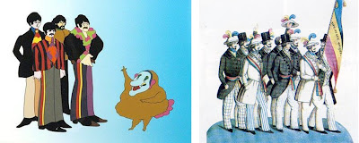


 For a project about nineteenth century letterpress I'm working on, I was looking into the pendulum swings of criticism about "Victorian" design. I put air quotes on the term because anyone with the slightest knowledge of nineteenth century styles– decorative arts, fashion, whatever– can see that Victorian is cruelly broad brush stroke. It's a term that has been tainted by 20th century prejudices. By the 1920s "Victorian" was the zinger, the punchline, the descriptor flung like a dead fish. It's amazing how critics of the 20th century –through the 1960s at very least–were coolly dismissive of all things with a 19th century aesthetic. And that was when they were being kind. I cant think of another period so freely reviled and ridiculed.
All this by way of saying that by the 1950s and 60s a few avant garde* souls like Push Pin Studios (Milton Glaser and Seymour Chwast et al.) were thumbing their noses at The Man or his stand-in, Swiss Modernism. Rediscovering the cast off visual detritus of the 19th century they made use of posters, engravings, old wood and metal type that were surely lying around in junk stores.
Designers in alternative genres, especially, created a cult look combining vintage display type, Art Nouveau patterning and kaleidoscopic drug- induced positive/negative visual vibrations. I had never stopped to think about how much of Psychedelia had its roots in nineteenth century visual reference, beyond the Victor Moscoso/Alphonse Mucha connection. With the Hippie epicenter in San Francisco, the old Victorian rooming houses and cheap apartments must have had something to do with it as well. And of course, the concept of a Decadent, Symbolist, absinthe-soaked, opium-toking nineteenth century must have seemed very appealing (and familiar) indeed.
Addendum: At bottom right is an 1840s watercolor of quasi-military protesters, which put me in mind of Yellow Submarine immediately....
*(The very avant garde, I suppose, had been Dadaists like Ernst, in the 20s-30s, who incorporated 19th century engravings and type into collage.)
Artwork from OldHandbills.com :
Rick Griffin 1967; William Henry 1968
William Henry, 1968
Bob Schnepf, 1968
Victor Moscoso,1967
Alton Kelley and Stanley Mouse, 1967
Bob Schnepf, 1968
Victor Moscoso,1967
Alton Kelley and Stanley Mouse, 1967


