skip to main |
skip to sidebar
 For a while now I've been mulling over the hollowness of "You"-- the purported prime mover in the consumer chain. Design your own personal sneaker, Hummer, pizza. Express your personality through the oxymoronic doublespeak of "mass customization." The escalating illusion is that now, with technology at one's fingertips, the power is in your hands. As with niche marketing, innovations with just your slice of demographic in mind, one is told many times over, "you deserve it." You're so busy/ important/overworked/ worthy, you deserve 500 channels of 24-hr HD sports (or whatever), you deserve soup in a go-cup, a good night's sleep with AmbienCR. Here's a fat-free fudge-dipped caramel bite with extra calcium created expressly for your over-40 bones. Coach or L.L. Bean in your Lincoln Navigator? Your choice! This proliferation of specious choice-- the so-called American ethos of individualism ("freedom") distorted through a lens of consumption. All of this disingenuous catering (pandering?) to "you." And then last week Time made "you" the Person of the Year in one of the most oleaginous essays I've read recently:
And we didn't just watch, we also worked. Like crazy. We made Facebook profiles and Second Life avatars and reviewed books at Amazon and recorded podcasts. We blogged about our candidates losing and wrote songs about getting dumped. We camcordered bombing runs and built open-source software. ...Who has that time and that energy and that passion? The answer is, you do. And for seizing the reins of the global media, for founding and framing the new digital democracy, for working for nothing and beating the pros at their own game, TIME's Person of the Year for 2006 is you.
What about me? Despite both designations having to do with the individual, presumed solipsism, and implied atomization, the "Me" of the Me Generation (I believe it was Tom Wolfe who christened the 70s the Me Decade, with "generation" being an extrapolation from that.) strikes me as a different concept. At its most elementary level, the term is subjective: me, I. And I read the term, at very least, as active --seeking out self-definition, though not necessarily through consumption. This "You" moment conveys an object observed and defined by others: what you buy, what you own, your 'audience.' The you as consumer defined by age/income/race/ demographic...
---
I only just recently saw the Frontline show "The Persuaders" on the web, although the episode is more than 2 years old. It is a disturbing and utterly fascinating overview of the current culture of marketing and advertising and its societal influences. The web site for the episode is dense with interviews, transcripts, commentary--it is a must. Someone there (cant remember which person sums it up) distilled for me what had been ill-defined complaints and ravings: the danger of an atomized populace in a completely immersive, consumer-driven society is that there is no longer a recognition of "the common good," or civic duty; democracy itself comes apart. Media critic Mark Crispin Miller (whom I had not heard of before) delivers some of the most devastating commentary. Consumers are feeders. All consumers do is consume. ...They're being manipulated to think only about the grass that they're chewing and nothing else, and manipulated into thinking about ways to get more grass. They're not operating on a sufficiently high level to participate in a democracy…
---
So the Burger King "have it your way" campaign of circa 1974 (?) was a brilliant precursor to the mass customization model...

 While I gather my thoughts and work on the several posts sitting in the "draft" line I'll put up 3 cards from my Christmas collection. At top is the very curious "Christmas Greetings from the New World." The reverse says the card was "printed in Saxony," obviously in English, though it was sent "To Willie, from Harold" entirely within the confines of Brooklyn. It is postmarked, 8 pm, December 21, 1911. The bottom two, polka dot sleigh ride and manic circular Yuletide, match, by happenstance, in warm red and silver, and are from c.1930.

 UPDATE Perhaps I should state the following reminder: these posts are my thoughts, not those of typeHigh or my business partner or anyone else. Aesthetic commentary aside, we certainly benefited from participating in the sale and I could have been more gracious about that. Also, I should have made clear the "Iraqi" comment below referenced a story in the Times that day that made a point about fluorescent lights.At the risk of being tedious: a quick overview fr om the sale. TypeHigh managed a respectable showing at the Center for Book Arts sale despite the fact we were out of our element aesthetically. Thanks to Doug's ingenious handiwork we had a professional display rack and many of the trappings of a real business. Most importantly, people (strangers, even!) will be writing and sending our cards. Amazing.
The tenor of the event was more clogs and rainbows than I'm comfortable with and the room, a ragged loft space awash in fluorescent light, said to me 'Iraqi detention center' a lot more than 'Happy Holidays.' We were made acutely aware of the need to find the correct audience.
Our "Lucky" magnets--vintage wooden Bingo pieces-- were a surprise hit. (Though when people asked why they were lucky I was tempted to just say "'cause I said so." They're Bingo pieces, people, they won't help you get a new job). The type on the tag was hand set in a great metal face from the Bowne collection called Samoa. Its got a quasi-"oriental"/Art Nouveau flourish to it. A little Googling finds that Samoa became a US territory in 1900, and I'm guessing the type was issued around then.
Trying to catch a cab after the show on Twenty-seventh and Broadway was far more dicey than I would have imagined. Clusters of what in another decade might have been termed hoodlums gathered in darkened doorways. A guy selling garish pink and blue fur pelts was talk-yelling animatedly. Was it heavily accented english? Something else entirely? Raised voices could have meant people having a good time or a fight about to break, and there was no easy way to tell.
A highlight of the evening was a chance to see Robert (Warner's) basement workshop in the Village (There's Robert in the mirror, above, left). Though there was a little hesitation on his part-- too many people? delicate sensibilities likely to be offended? embarrassing things left in view? rat poison? -- we prevailed. Down the stairs, through a door, along a narrow dilapidated corridor, right, through another door, out into a small rear courtyard and to the left, by the wooden stairs. We all crowded into the workshop past jars of lamp black and springs, boxes marked "marbles" or "better photographs", piles of papers, Howdy Doody heads, books, toy eyeglasses, drawers open and quietly exploding, and an ample sprinkling of glitter.
When we'd taken in all we could, we went back, around, up and out for some Pan Asian cuisine at a sprightly little restaurant in the shadow of the Jefferson Market clock tower.


 One might think it a happy coincidence that the Sunday Times reports on the resurgence of letterpress printing just when my friend Doug and I debut our line of hand-printed cards. One could think so. But if one were me, one would know better. Everybody and their uncle is churning out letterpress these days and furthermore if you're reading about it in the Times, it's already gathering momentum on the long slide to "over."
In any case, Doug and I have lavished absurd amounts of time on the venture we're calling typeHigh. I probably would have preferred to wrangle over the name a bit more, but luckily Doug is a decision maker. (If it were just me, I'd be tempted to call myself 'negative space press') Type high means, simply, something at the same level as the face or printing surface of the metal type (see the diagram, above, from the very informative briar press). Some of the cards are based on 19th century type specimens, others are just free-wheeling experiments, all incorporate some 19th ornament. Despite the grand intentions, and generous donation of much-discussed onion skin paper, we never did manage to line our envelopes. (I regret not being able to add that detail but years would have gone by, I'd be a bitter, ink-stained crone and we'd have worn out the super-human generosity of Robert Warner at Bowne & Co. And as I think about it, it would most likely have been just a bit de trop) Most of the cards are 3 or more colors which means we fed the card through the press once for each color plus another for the imprint and another, still, for scoring. And these are brawny 19th-century foot-powered machines, no sissy power- or Vandercook presses! My leg muscles are now comically over-developed.
We will be sharing a miniscule portion of Robert's abundant table of wonders (typeHigh and piled high. AH hahaha) attempting to sell our wares at the Center for Book Arts Holiday Sale. Look for our panicked, clueless faces at the
Center for Book Arts Sale
Friday 12/15 ($10 benefit), 6-9 pm
Saturday 12/16 (free), 11 am to 5pm
28 West 27th Street, 3rd Floor


 I think I will make "Highlights" a regular feature here.
Inspired by a great found-photo site I came across the other day, Square America,
I'm hauling a few of my acquisitions out of storage.
From top: Sacred Snakes of India. Aside from the great banner and imposing pavilion, what got me to part with my $2 or whatever were those penants flying atop the cupolas. Obviously some sort of carnival going on. I would say 1890-1900. A sideshow sensibility to a snake attraction I think, rather than state fair. No hint of beach or I would hazard Coney Island.
Creepy Family. Rather Dust Bowl/Grapes of Wrath/American Gothic, no? Farm worker family portrait c 1930, perhaps. I read a lot of helpless befuddlement and resignation in Father's face. He's actually rather handsome (and note the meerschaum/calabash pipe), unfortunately the children inherited all their genes from Mother who appears to be part woman, part bull terrier.
Revelers. I like the cheeky gaiety of the set up but I found something very peculiar about the perspective in this shot. Is it a composite? No, but the "Equestrienne", the Joycean man and the Roadster Couple don't seem to sit in the same plane. It's particularly nice the way the car seems to be driving out of the frame at left. Eight people, c. 1918, out on a lark, as they might have said. I think I could have been friends with them.
Little Bear. A new acquisition. He sort of reminded me of Arne Svenson's Sock Monkeys. Oddly, the inscription on back reads, " Nov.1944/ autograph dog/ To Bob/From Snook McCloskey" I Googled Snook McCloskey, hoping to find something. Alas, no documents returned on that search.
Next time: antique buttons-on-cards? or perhaps my as-yet-very-limited "old library card" collection. Let's vote.


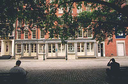
 Almost every Sunday for the past few months I've been at Bowne & Co, Stationers. My friend Doug and I have eagerly spent an absurd amount of time planning, designing, printing, second-guessing, amending, scoring and folding a series of letterpress notecards loosely based on 19th century type specimens and ornament. We still have wrapping and packaging (and selling!) to go. More on the cards next time.
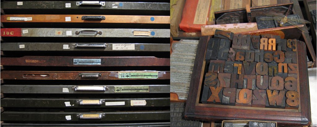
I've come upon Bowne unexpectedly, through Doug, who started volunteering there. On stepping into the shop the first time I was almost giddy. Cluttered, dim, with wooden displays and shelves lining the walls, the place appeared reasonably authentic on first view, but I knew, in New York, that was impossible. I was only slightly deflated to confirm it was a recreation. Bowne & Co. was founded in 1775; this store is a 1975-vintage evocation of a printing "job shop," c. 1875. (Bowne, the company, still exists, as a global financial printer.) The shop has an amazing collection of type both metal and wood, an assortment of curious machines of obscure purpose, many wooden cabinets and drawers, mostly askew, and fantastical piles of oddments.
Most of the oddments belong to Robert Warner the "master printer", curator, and character of the shop (that's him printing, above, on the shop's 1901 Golding press). Almost Seussian (or is it more Felix with his bag of tricks?) he is focussed, jovial, fond of puns, and has an air of the surreal about him. Robert is a fascinating collage- and correspondence artist and describes himself as a 'gatherer.' He scours eBay for odd lots of antique wallpaper, ancient ledgers, disbound books, 1930s catalogs, cabinet cards and other paper ephemera and he most certainly has an exuberant way with the detritus of bygone eras. I'm jealous of his inventory. He also appears to acquire people, like a set of identical twin sisters from somewhere mid-country with whom he corresponds. The twins definitely veer more toward the Tim Burtonesque: identical clothing and hair style, theatrically prim, and obsessively creative. I've not actually seen these girls in person, but they do make a very intriguing cameo in this engagingly quirky film about Robert's art.
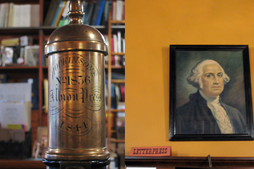
The store is a working printing office. It is also under the auspices of the South Street Seaport Museum and as such it has the mission to 'demonstrate' the arcane processes and 'educate' the unwary public that wanders in, however few they might be. Thankfully Bowne doesn't wholly ascribe to the Colonial Williamsburg school of 'living history' and there is no "authentic" printer outfit to wear, save for a very real printer's apron. Though one person did tell Robert, who is partial to overalls and caps, she liked his "costume." I think he enjoyed that. And so, by default, for these past many Sundays, I've been part of the show.
top photo from the South Street Seaport Museum, the rest by me!

 For a while now I've been mulling over the hollowness of "You"-- the purported prime mover in the consumer chain. Design your own personal sneaker, Hummer, pizza. Express your personality through the oxymoronic doublespeak of "mass customization." The escalating illusion is that now, with technology at one's fingertips, the power is in your hands. As with niche marketing, innovations with just your slice of demographic in mind, one is told many times over, "you deserve it." You're so busy/ important/overworked/ worthy, you deserve 500 channels of 24-hr HD sports (or whatever), you deserve soup in a go-cup, a good night's sleep with AmbienCR. Here's a fat-free fudge-dipped caramel bite with extra calcium created expressly for your over-40 bones. Coach or L.L. Bean in your Lincoln Navigator? Your choice! This proliferation of specious choice-- the so-called American ethos of individualism ("freedom") distorted through a lens of consumption. All of this disingenuous catering (pandering?) to "you." And then last week Time made "you" the Person of the Year in one of the most oleaginous essays I've read recently: