skip to main |
skip to sidebar
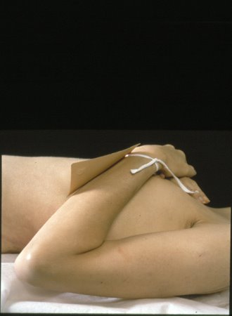
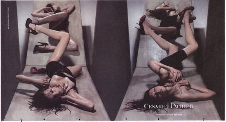
 I suppose it was inevitable, with this spate of fashion musings, that my attention would return to a topic I ineffectually tried to tackle--what 8? 9?-- years ago. It was after the much- editorialized "Heroin Chic." Prada had a stunning print campaign that I found so beautiful, so ...curious. (An image from the campaign, below left, by Glen Luchford) Why were dead women being used to sell designer clothing? Pornography, sure, bondage, ok, even kiddie porn (though Calvin Klein didn't get too far with that before it was pulled) but corpses? How, exactly, was that resonating with The Public? Fashion editorials that had formerly exuded an air of cultivated boredom were giving off more than a whiff of decay. Could it be that Sex had played itself out? Was Death simply the only (tittilating) thing left? Was there anything more to it? It struck me that a photography show I'd seen several years earlier, Andres Serrano's Morgue series (Aids-related Death II, 1992, below right) was, in hindsight, proving to be enormously influential. Or perhaps just ahead of the curve of what theorist Mark Dery came to call the "New Grotesque"...
And now years later, post-Damien Hirst formaldehyde fetishes, post-"Six Feet Under" we still have the same tortured relationship with that all too earth-bound, all too real body. We've decoded it, sliced it, stripped it of skin and put it on display. Suctioned, cut, capped, injected, pulled and polished "we" grow almost inert under growing mantles of flesh and have anorexia scares on the runways. The past century has been about the defiance of death through science, medicine and lifestyle, yet it appears that the more we negate death, the more we're preoccupied with it. Like any neurosis, it pops up in the most intriguing places.


 I just now looked up “the tyranny of things”, a somewhat overwrought but appealing phrase that I had seen somewhere a few years ago and filed away. According to Bill Brown, a professor at University of Chicago and co-editor of Critical Inquiry, it was the title of an anonymous essay that appeared in the May, 1906, Atlantic Monthly. The author lamented that,
we make 'collections,' we fill our rooms, our walls, our tables, our desks, with things, things, things.
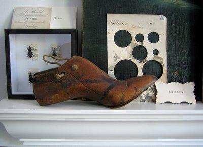
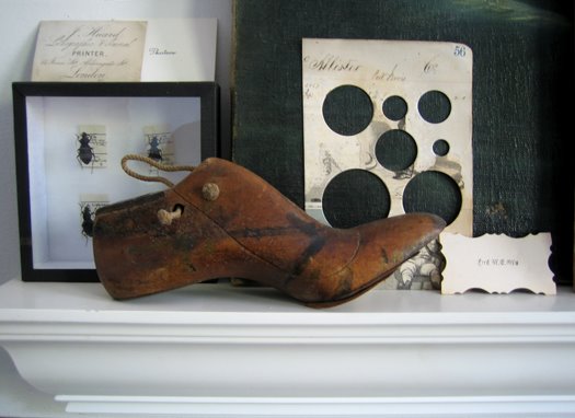
I don't have specific collections (although for a while I collected ticket stubs) I just tend to acquire things. The common attributes being “old” and I suppose “odd.” Those two traits often amount to "worn", "rusted", "weathered", by default if not actually by choice. Paper ephemera and postcards, wooden objects, shells, green pottery, odd pieces of metal, naive paintings, hotel silver, flea market photos, letters/signs/numbers– I have been oppressed by this “tyranny” for a while now and I'm ambivalent about it. I love each thing, but am oppressed by things. Some collectible, most just collected.
Virtually none of this stuff is personal memorabilia. In a (somewhat windy) essay I found randomly, the Dutch artist Tjebbe van Tijen discusses personally meaningful objects:There is a story with each of such objects, in most cases the story is not visible, the object does not depict a particular event, the event needs to be told. Language to make "the invisible visible" says Krzysztof Pomian in his study on the 'Origin of the museum' ... objects that have changed their status, from an object with use value to an object representing what can not be seen.
I feel that is true of my stuff, too, that somehow they hold stories I would not otherwise "see." Of course I also have, and acquire, things for "purely" aesthetic value, but I think that is ultimately a component of their "stories." By way of explanation of this sense that these things possess stories is the peculiar and poignant Japanese tradition of Harikuyo:
the Festival of Broken Needles. Harikuyo is a solemn rite of respect and thanksgiving [held on February 8] in which the worn and broken sewing needles used in the previous year are retired to a sacred resting place.
Quite different in its particular but similar in essence.
I began this post yesterday and it's a very odd coincidence that today's Times has a small article about a web site called zebo where members list and post their everyday possessions (as well as "wants"). The site's tagline is “Hi. What do you own?” Fascinating. I'd love it* if it wasn't so disturbing. This is where a discussion ensues on the nature of escalating consumption as illusory respite from psychic emptiness and its relation to the current state of American society...-----
*I once had an idea for a 'conceptual art piece' where I would label every possession I own (mostly I was thinking of those of the "collectible" variety) with museum-like captions and provenance: what era the item is likely from, what it once was, why "important", where I purchased, what I paid.
 Souvenir, according to the dictionary, is something that serves as a reminder: a memento from the French: the act of remembering.
What is a souvenir from a non-place?
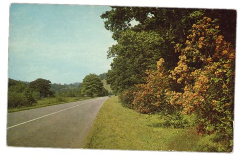
This is from my collection of generic postcards, scenes that are labeled "Dextone Beauty Scene," as though 'Dextone' conjured the very leaves, or, in this case,"A Ride in The Country." (Actually a road in the country.)
"The Country."
"Greetings from Somewhere I'm not Usually."
The back is imprinted with "Greetings from Holcottsville, NY" although Margaretville, Shandaken, or any other quaintly named upstate town may be selling the same scene.
I did, in fact, buy this card in Holcottsville so it is a souvenir but I couldn't really describe the town though--I don't remember it at all.
And now I'm going away for the weekend.
 In rearranging papers last night, I came across this color chart from the English paint company Farrow & Ball (a section, above). There are a number of reasons why this is one of my favorite things of recent era: it's a combination of taxonomy, pure aesthetics, fanciful word-names and allusive, meandering explanatory text that spurs more questions than it answers. For example, there is a color called "Monkey Puzzle," a very dark green-gray.
The description reads:
A typical 19th century estate color which has, like so many successful colours, endured down the generations. Good with both brick and stone, and indeed furniture.
"?"
Another color, “Dauphin,” I realize in hindsight, is given a very elliptical explanation:
An earth pigment colour in the early 18th century school of ‘drab’
First, “school of ‘drab’” is just so... perfect, so Edward Gorey... second, how does one get “Dauphin” for a khaki olive brown? After some investigation, I see perhaps F&B are too genteel to explain that the color ‘caca-dauphin’ became fashionable when the much-longed-for French crown prince was born to Marie Antoinette, in the 1780s. Ah, Dauphin's Poo. With colors like "Ointment Pink", "Dead Salmon", "Archive", and "Mouse’s Back" how can you not want to know everything about this company?Creating color names would be my dream job. I remember thinking this in-- what, the early 90s?-- when JCrew was changing popular culture with sweater choices like "Pool" and "Cement." Precious, yes, but in a certain way, how brilliant was that moment? [Didn't Saturday Night Live do a skit? Not sure. But its so easy for color-naming like that to go very, ham-handedly wrong]. Women’s cosmetics did interesting things with color naming but mostly of the punny, "Tickle Me Pink" and expected "Red Wine" variety. Before J Crew: "blue"and "grey", after: the welkin's the limit!---
some interesting color words: gamboge, filemot, glaucous, dun

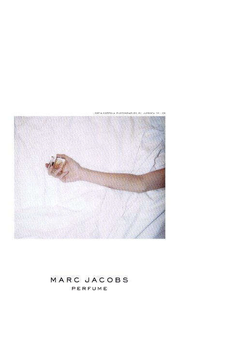 I suppose it was inevitable, with this spate of fashion musings, that my attention would return to a topic I ineffectually tried to tackle--what 8? 9?-- years ago. It was after the much- editorialized "Heroin Chic." Prada had a stunning print campaign that I found so beautiful, so ...curious. (An image from the campaign, below left, by Glen Luchford) Why were dead women being used to sell designer clothing? Pornography, sure, bondage, ok, even kiddie porn (though Calvin Klein didn't get too far with that before it was pulled) but corpses? How, exactly, was that resonating with The Public? Fashion editorials that had formerly exuded an air of cultivated boredom were giving off more than a whiff of decay. Could it be that Sex had played itself out? Was Death simply the only (tittilating) thing left? Was there anything more to it? It struck me that a photography show I'd seen several years earlier, Andres Serrano's Morgue series (Aids-related Death II, 1992, below right) was, in hindsight, proving to be enormously influential. Or perhaps just ahead of the curve of what theorist Mark Dery came to call the "New Grotesque"...


